Friday, August 19, 2011

Our New T-shirt Designs For Farm Boy Brands

Farm Boy / Farm Girl makes very cool t-shirts for folks who love life on the farm. Their target audience is teens and young adults, which is right up our alley, style-wise. Recently, they asked us to create 5 new shirt designs—3 for Farm Girl and 2 for Farm Boy.


We always start out with research before we begin sketching. Inspired by WWII-era poster and advertising art, we sketched out rough ideas for each design.


Once the Farm Boy team approved our sketches, we rendered our designs in color using Adobe Illustrator. They gave us several options for shirt colors, and we put together color palettes that popped off of our favorite shirts. Once the color art was approved, we used Photoshop to add a classic, aged effect. The new shirts are going to be featured in the Fall 2011 line up in their catalog and on their web site.


Tuesday, August 16, 2011

The Pharmacy Logo: From Concept to Completion


Recently, we were asked to create a logo for a new restaurant opening in East Nashville called The Pharmacy. The co-owner, Terry Raley (who also happens to be co-owner of Holland House Bar & Refuge), envisioned a turn-of-the-century pharmacy theme — when drug stores were more than just drug stores and you could get sodas, alcohol and burgers. Throw into the mix a Southwestern/German beer garden and voila! — you have The Pharmacy. Staff designer/illustrator Andy Gregg took a crack at it and below is his process from start to finish.


First, we started with late nineteenth century/early 20th century packaging. We produced a style board with multiple examples (like the ones above) to show to the client, and then got their feedback on which ones they preferred. The owners of the Pharmacy liked the colors from the Mucilage packaging and the angled typography of the Medford logo, among several other reference images.


Next, we produced several tight logo sketches. Each logo variant tried to include some aspect of what the clients liked in the style board.


The clients selected the sweeping, diagonal lettering used in a few of the versions. This was inked and scanned into the computer for tighter rendering.


After a little more development (actually a lot more) we arrived at a final black and white logo. Having already incorporated angled lettering into the design, we went with a seal motif for the tagline, as we really liked this in some of our reference images. This was also a bit more space-efficient (plus it allowed us to render a wicked-cool ampersand!)


Finally, taking color cues from the mucilage packaging above, we assembled a color version. All typography was hand-rendered, and the clients seem to be very happy with the overall result. 

The Pharmacy will be opening this fall, and in the interim we will be working on even more designs for them, including a style guide, mugs, shirts, secondary logos, and much much more. Stay tuned.

Tuesday, July 12, 2011

Paper Vs. Digital

We are excited about all the advances in e-books and the iPad. As designers, it is a little scary to think how it will change the graphic design biz, along with the printing and paper industry. Fortunately, there are some paper products that just cannot be replaced by digital media. See what we mean?

Monday, July 11, 2011

New Wine Revolution Posters

It’s fun to create a new brand and watch it develop over time. Last year, we started with a logo design for our client the Wine Shoppe. Next, we helped create the look of their web site and store graphics. Then we designed a few ads and even created 5 wine prints to include in our Spirit of Nashville Collection. As the brand evolved, we made sure to keep a lush, rustic, inviting, European vibe in every piece we created.


This year, the owners of the Wine Shoppe wanted to launch a campaign called the Wine Revolution. The goal is to give the common man (or woman) access and knowledge about rare and fine wines from around the world. To create a revolutionary vibe, we designed a series of 3 posters to use during the campaign. They produced very nice video and posted it to their web site to kick off the campaign. The video does a very good job at promoting the brand by featuring brand elements we created—poster art, biz cards, their logo and views of their store interior (which features paint colors we helped them choose.) Click here to see the video.


Above are the 3 Wine Revolution posters we created. We took our visual inspiration from old Communist propaganda posters like the ones below. Then we infused the Wine Shoppe color palette and logo into our designs to tie them into the brand look we’ve established. Folks liked the Wine Revolution prints so much that we decided to print up a few extras to sell. They are available in our Studio Store for $30 each.


Next, we will help the Wine Shoppe incite a Wine Revolution by using our art on a few promotional items such as tote bags, bottle sleeves, or kitchen magnets.

Friday, June 17, 2011

Beautiful & Creative Ampersands (For Typography Nerds Only!)


This ampersand character by Conor and David is based on
Helvetica Neue 75 bold and made up of 40 helium-filled balloons.

As designers, our work is often only as good as the typography and imagery we choose to include in our designs. When inspiring visual communicators create art from letter forms, the rest of us designers totally geek out! Check out Inspiration Feed’s blog to see the many ways other creative folks have interpreted one the alphabet’s most beautiful characters.

Thursday, June 16, 2011

Spirit of Nashville Donates Commemorative Flood Prints to the City


After the 1-year anniversary of the Great Nashville Flood, we met with Nashville Mayor Karl Dean to present him with 3 jumbo canvas prints of our Spirit of Nashville flood relief designs. We wanted to thank him for his leadership during a very challenging time and commemorate the strong character displayed by Music City during and after the flood.
 

Joel Anderson, founder of Anderson Design Group and the Spirit of Nashville Collection wanted to give the city a set of these prints so the art could be displayed in a public area where all of Nashville would be able to enjoy the art for years to come. The 3 over-sized canvas prints will be permanently installed in a public building that has yet to be determined.
 

The two flood prints from last year have already sold out, raising over $30,000 for flood relief in the process. The new 1-year anniversary print is selling well, and all the profits are being donated to the Community Foundation’s flood relief fund. To order your own print and send $30 straight to continued flood recovery efforts, visit our Spirit of Nashville site.

Monday, June 13, 2011

Creating a Brand: Peter Nappi Boots & Shoes


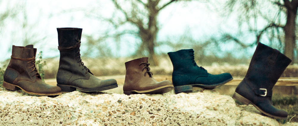
Over a year ago, a stylish entrepreneur named Phillip Nappi contacted us to share his vision for a new artisan boot and shoe company that would honor his Italian grandfather’s legacy through hand-crafted boots, bags and other dry goods. Inspired by patterns of 100-year old boots, Phillip worked with a team of artisans in Italy to produce prototypes for a full line of boots and bags.


When we first saw the boots, we were convinced that this line of leather goods would be a smashing success if the branding & marketing materials could tell the story. Creative director Joel Anderson loved the boots so much that he insisted on being the first customer in the world to own a pair of Peter Nappi boots. As soon his boots were delivered, he knew this branding project was going to be a labor of love. (Joel likes to be a consumer of the products and services he and his team promotes—this ensures an immediate connection and a real-life experience as a member of the target audience.)


We joined forces with John Moessner, a great young film maker and photographer. We also partnered with Cabedge, an amazing web site development firm based in Nashville, TN. With our logo & brand development, John’s film and photography, and Cabedge’s web site building capabilities, we created all of the essential components needed to define the brand and launch this new company in style.


We started with research and sketching. Our logos needed to feel like they were created 100 years ago. So we poured over old tobacco tins, catalogs, antiques, ads and poster art from the early 1900’s. We kept in mind that our logo and branding art had to tell the story of an Italian shoe maker who immigrated to the USA and passed down a legacy of art and craftsmanship to his grandson. We sought to represent the quality, beauty, comfort and style that makes these beautiful $700+ boots and bags worth every penny. After several rounds of rough logo concepts, we arrived at a clean, simple logo based on the signature of Phillip’s Italian grandfather (taken from copies of his Ellis Island immigration papers.) The resulting logo seemed to fit the vision and the brand perfectly.


Once a logo was finalized, ADG designers Ligia Teodosiu and Edward Patton started creating a comprehensive style guide that dictated colors, fonts, backgrounds, patterns, etc. necessary for creating the packaging, hang tags, press releases, and a comprehensive book that would tell the Peter Nappi story and showcase the products. Joel and Ligia consulted with Cabedge to help make the web site look like a natural extension of the printed materials. Phillip and Dana Nappi already had a very keen vision of how to create the perfect showroom via colors, textures, materials, props and furniture they collected from Italy and other places. As the creators of this line, they brought their own sense of color, mood, style and story to every aspect of the project, making the whole campaign a true team effort.


The Peter Nappi web site (built by Cabedge) conveys the essence of the Nappi brand via a film created by John Moessner. The site showcases all of the products, makes ordering possible, and offers a virtual tour of the Peter Nappi showroom via John’s awesome photography.


Overall, this branding project is a great example of what happens when experts collaborate, guided by a branding strategy that ties everything together and keeps everyone “reading off of the same page.” The Nappis couldn’t have been more pleased with the results. And neither could we!