Friday, July 20, 2012

2012 Austin City Limits Music Fest Poster

Recently, we were asked by C3 Presents (an event organizer responsible for some the country's biggest concert events) to create the official poster for this year's Austin City Limits Music Festival. We were honored and excited, and staff designer/illustrator Andy Gregg was put on the task.

C3's poster needs and parameters were somewhat unique: they wanted to feature an Austin skyline, and they needed three different versions of the poster to sell on their website, sort of a "good, better, and best". Andy worked on this problem for a while. Posters from ACL's past were sometimes printed different ways to denote their tier of quality (e.g. last year's high-end print was a five color gravure print), but it was often hard to distinguish the different levels from a distance, and especially over ACL's website. The concept developed in layers, but eventually Andy arrived at this design:


The shaded-in area of this rough thumbnail would act as the good and the better versions of the poster at 18"x24", while for the best version the wider landscape would be added to create a poster at 36"x24".


This is the final art for the good and better designs. It features a band on stage, with a condensed skyline in the background and, of course, the famous Austin bats. The city landscape is stylized and uses bright colors, because we and the client both wanted to stay away from anything that felt too stereotypically western. All the lettering is custom. Though the designs are essentially the same, when printed the good version will be a 5 spot color print with a run of 3,000. The better version will be silk screened (by our friends at Kangaroo Press) and numbered, with a final run of 500.


Last but not least, the larger poster was built from the original. The extra space was exploited to add local Austin landmarks like the South Congress neighborhood, UT Tower, and Barton Springs, along with many others. This design will also be silk screened, but on cotton rag and by DL Screenprinting in Seattle. It will be numbered and signed, with a final run of 100.


 This was a fantastically fun project to work on, and an illustrator's dream. Now we've just gotta catch a flight to Austin for the festivities...

Friday, July 13, 2012

NEW Coastal Collection


As you can see, we’ve been dreaming of vacation all summer. Now that we have cranked out a bucket full of new designs to create our latest poster series, we probably will do just that!

For quite some time now, have had a lot of interest from the buyers at Fab.com (and from decorators & fans) in vintage-looking posters with nautical or coastal themes. So we decided to create the COastal Collection and get it done while it was still summer time! Since we could not get away from our drawing tables and iMacs, we put on our flip flops and tacky Hawaiian shirts and started creating breezy, whimsical seaside prints. (We tried wearing sunglasses, but it kept throwing off our color perception!) Our goal was to create art that would look great in a vacation cottage. For land-lubbers, we tried to illustrate art that would transform any ordinary room into a slice of Paradise.


We drew our inspiration from vintage travel posters, magazine ads, restaurants, match book covers. Our style was based on nostalgic illustrative design. We used color, fonts and open space to conjure up feelings of relaxation, escape, amusement, comfort, and leisure. Bright colors, nautical icons, and silly phrases made us smile, so we used them to the fullest. Once we put together 24 poster designs, we created a postcard set, and launched a full line of ready-to-frame prints in two sizes: 18" x 24" and 11" x 14".


See the entire collection on our Anderson Design Group Studio Store site. If you cannot get to the coast this summer, do the next best thing and turn a room in your home or office into a seaside getaway!


Friday, June 15, 2012

Grand Opening of Legato Gelato!


As designers and branding consultants, we are always meeting smart, passionate people who come to us with big dreams. They usually show up with a plan—a vision and a concept that needs an image— and they ask us to help them make it a reality. (It is a big responsibility to be entrusted with the hopes and dreams of people who have put everything on the line!) These brave trailblazers are bringing about America’s economic recovery, providing jobs and zest to their communities, and it’s an honor to be a part of their success stories!


When Terri-Ann and her husband Berchaun asked us to help them create the branding for a new gelato cafe, they brought us samples of her frozen desserts. We were blown away by how good this gelato tasted! We knew that Legato Gelato was world-class stuff that would be made right here in Nashville, TN. We were given a few months to create a logo and help them to develop a branded look for the new shop, which was set to open on June 15th, 2012.

We sketched up several different looks...


Terri-Ann chose a clean, classic design created by our all-star logo designer Edward Patton.


Once the color palette and logo were done, we worked with the sign vendor to create outdoor graphics. We also designed labels for use in the store and graphics that would end up on t-shirts and other stuff. Terri-Ann had great ideas for paint and furniture—she consulted us all along the way to be sure that everything matched from the umbrellas to the labels, signs and wall paint.


We had fun mixing and matching colors, stripes, and shapes to create a cohesive, branded look that started at the curb and went right up to the counter.


Legato Gelato now offers delicious handcrafted gelato and sorbetto at their brand new shop in Edgehill Village, Nashville.


Terri-Ann’s goal is to make the best gelato possible. To do this, she found that there are no shortcuts. Her gelato is made fresh daily. Each of her gelatos and sorbettos is made in small batches using fresh ingredients, including growth-hormone-free milk from Tennessee and, whenever possible, produce from local farmers.

In addition to Legato’s six signature flavors, the seasonal selection of gelato and sorbetto rotates daily and features traditional favorites like Pistachio and Chocolate Hazelnut alongside more adventurous creations like Pineapple Basil, Lavender with Nobel Springs Goat Cheese, and Peanut Butter and Preserves. Legato Gelato also offers a variety of homemade baked goods, frappes, affogatos (espresso over gelato), drinking chocolate and Italian sodas.

Wednesday, June 13, 2012

NEW “Vintage” Travel Posters!

We don’t get out much, but we have had lots of fun creating new travel posters for places we went to back when we actually had time to travel. Now that we are so stinkin’ busy doing cool stuff for Denny’s, Williams-Sonoma, Ram Trucks and other awesome clients (who found us on Fab.com,) we sit in front of our Macs all day, dreaming of the places we’d like to visit when things calm down. And for us creative-types, dreaming usually leads to inspiration for new poster designs.

That is how our Art and Soul of America line has grown to include over 50 different favorite U.S. travel destinations. We just added 2 brand new national parks posters—Glacier National Park and Joshua tree National Park so we would have enough designs to produce a 2014 calendar with Zebra Publishing. (Yeah, they work THAT far in advance!) Both of these designs were created by Michael Korfhage and Joel Anderson. It was fun creating different temperature extremes by using icy colors for one design and hot hues for the other.

 
Michael and Joel have also been experimenting with creating some State Pride Prints. They started out with 3 designs: New York, California and Texas. (More State Pride designs will follow as time permits.) These 3 new designs are available on our store site in the Art & Soul of America collection.


We still have several more American cities and national parks to cover before we can say that the Art and Soul of America collection is done. So look for Minneapolis, Kansas City, Pittsburgh, Dallas, and several other prints to be added in the fall.

After covering so many U.S.cities and parks, we have set our sights on world domination. We’ve always loved European Travel posters and drooled over the chance to integrate motifs, colors, and typography from different cultures into our designs. We started the World Travel collection with 9 different prints that feature some of our favorite international cities. Shelby Rodeffer worked with Joel Anderson on 7 of these designs. Joel worked with Christopher Stewart and Michael Korfhage to create the 2 Paris designs. 


We plan to add several other cities over the next year. This cool new collection is now up on our studio store site under the World Travel heading. Here are close-ups of a couple of the prints...


We decided to add one more collection to our studio store site. Political Pimp is what we are calling this ever-growing arsenal of election-related posters... As we watch the election coverage, new slogans and gaffs will surely provide inspiration for future designs.


Check out the 2 latest pithy political prankster prints by Joel Anderson...


And finally, our newest collection of travel poster art came from an unexpected place—the Denny’s restaurant menu! Several months ago, folks from Denny’s ad agency saw our prints selling on Fab.com. They liked our classic-looking Americana prints so much, they hired us to create 7 new designs for their Tour of America menu, which is in all the Denny’s restaurants in the USA and Canada from now until December 31. After the menu art was finished, we all decided it would be swell to create a collection of ready-to-frame posters, postcard sets, and note card sets.


The Denny’s Tour of America collection was added to our store site on June 1st. The prints and cards will be available until December 31, 2012 or as long as supplies last!

Wednesday, May 23, 2012

New Branding Project: Revolution Doughnuts


Since the economic down-turn, we have seen a lot of entrepreneurs put everything on the line to start up new ventures and turn their dreams into a reality. We enjoy being entrusted with these dreams and doing our part to help other small businesses spur the economic recovery. Since January, we have created new branding for an organic farmer, a gelato shop, a beer brewer, a hair salon, and other cool stuff that we can’t talk about yet!

A few months ago, we had a request to create the branding for a new doughnut shop in the Atlanta area. Owner Maria Moore Riggs hired us to help her develop a classic, home-grown brand identity for her shop which was slated to open late in the spring of 2012. She sent us some style research to show us the basic vibe she was looking for (some of her style samples were actually things we designed!)

Maria wanted to re-brand her baking biz (formerly called The Little Hen Bakeshop – a Decatur Farmer’s Market vendor) – to be a real brick & mortar store serving coffee and all-natural specialty doughnuts. The new shop will be called Revolution Doughnuts, and it will be located next to Ale Yeah! and Avellino’s Pizza at 908 West College Ave in Decatur, GA.


Once we reviewed her style research, we baked up some rough logo concepts for her to sample.


Maria found one rough logo concept to be particularly tasty. So we took that concept and rounded it out as a more finished-looking brand mark.


We finalized the logo and the color palette. Then we applied the new look to a few items to show how the branding could work on merchandise, etc.


Maria describes the cafe/production kitchen this way: “We are starting a doughnut revolution in the south – returning to a time when doughnuts were simple and tasty – made from scratch with real food ingredients – without all the pre-fab mixes, funky oils, preservatives, fillers, or stabilizers that the big doughnut chains use. In addition to our regular menu we will also have vegan and gluten free treats.”

We hope to taste her doughnuts soon and celebrate the realization of her dream when the shop opens. (Click here to see her Kickstart video.)

Tuesday, May 8, 2012

Show Your True Colors This Season!


With election season heating up, we thought it would be fun to poke a little fun at the whole spectacle. By the time November finally gets here, we are all going to be sick of political news coverage and commercials! So to take the edge off of things and celebrate our great democratic system, we set out to create 2 sets of political prints that will allow folks to show their true colors in style.

The first set of prints was based on an old horror movie poster look. We spoke with the actress that posed in this old photo from the movie “It Came From Outer Space.” (Her name is Kathleen Hughes, and she is a big fan of our work!) Kathleen gave us her blessing to use her face on these posters... although she wouldn’t tell us which one was her favorite!


After spoofing the Attack of the Candidates that seek to steal our votes, we decided to create a pair of mascot posters. Making a bold statement by using only red and blue on an aged paper background, we created simple graphics of a butt-kicking donkey and a head-stomping elephant to serve as iconic mascots for each party. We finished off each poster by touting some of the core party values, and playing up the party colors—red for Republicans and blue for Democrats.


All of these posters are available in our Anderson Design Group Studio Store site under the Vintage Ad Follies Collection. Show your true colors by decorating your home or office with these prints, or buy them as gifts for your favorite hard-core political junkies!

Monday, March 26, 2012

New Branding Project: Rahal Farms

Back in late fall, architect and farmer Michael Rahal approached us with a branding opportunity. He founded Rahal Farms, which is located in the historic farming village of Fernvale, Tennessee. His farm practices holistic, sustainable land stewardship, compassionate animal husbandry, and educational community outreach in order to produce healthful, delicious and ecologically sound food.

Photography by John Moessner

When we visited Rahal Farms, we were impressed at how Michael’s animals are given the opportunity to graze and roam freely and live together as a community. They all interact and behave like one happy family! The goal of our branding would be to suggest artful, healthy, earthy farm-fresh goodness while keeping the happy animals at the forefront.

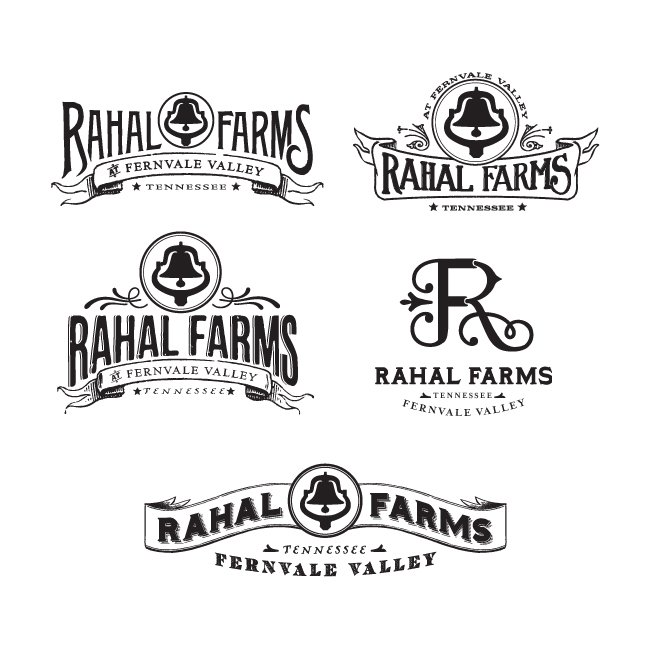
Our challenge in designing the logo was to create something that could work across a variety of platforms, from product packaging, to signage, to a future event space and teaching kitchen. This meant that it had to be simple, and we either needed to use one iconic shape or custom typography to express holistic farming in the most traditional sense. Throughout our exploration, we wanted to be sure the logo felt warm, welcoming, and even nostalgic. Below are several of our initial ideas, created by Ligia Teodosiu, the lead designer/illustrator on this project.


Based on the feedback we received from the client, we were able to narrow down the selection to a few favorites:


The clear winner became the logo that incorporated the "R" and "F" in a way that felt elegant, warm, and wholesome. From this we finished off the logo with earth-tone colors.


The simple design allowed us to translate the brand to the many outlets of Rahal Farms. Below is an example of the logo used as an extension of Rahal Farms, for The Kitchen at Rahal Farms:


Now that Michael had an evocative logo, he needed some packaging to boot. With his hens producing 400 eggs a day, we scrambled (no pun intended) to create an egg carton label so he could start selling his delicious farm-fresh eggs. He was looking for something that would really set his eggs apart on the store shelves and elevate his product above all others in the same category. It was back to the drawing board for us as we wrestled with the best possible way to sell his farm-fresh eggs. 


After several different attempts at establishing a look for the top of the label, we finally settled on one we all felt was egg-ceptional and carried the same look throughout the rest of the label. We finished it off with warm colors and an egg carton that not only complemented the colors of our label, but would really stand out on store shelves. 
 

The final label was printed on French Speckletone Paper in Cream Cordtone. We finished off the branding for Rahal Farms with some business cards, a letterhead and envelope, also printed in the same paper family. 

Once we had finished the branding and packaging design, we worked with our favorite web designers to translate the printed branding into an engaging on-line experience. We hired John Moessner to shoot beautiful photos and produce a moving film about the farm. Then we asked Kelly Bainbridge to write some informative text, and guide the process to create a web site that not only informs, but inspires people who love healthy, holistic farm-fresh products. (Ryan Pflasterer with www.BehindTheMule.com and William Donnall with www.SodiumHalogen.com did a fabulous job building the www.RahalFarm.com site!)