Thursday, January 31, 2013

Artisan Mac n' Cheese Packaging

Step aside blue box mac and cheese, there's a new Mac Man in town! Dan Stephenson of Dan's Gourmet grew up loving the famed American comfort food, so it's no wonder that his passion for mac and cheese propelled him to create a collection of uniquely crafted mac & cheese recipes. While he started out selling his "Mac Pacs" in Farmer's Markets, he had his sights on the frozen food aisle. With all the big players in the section, Dan knew that if he could just get people to pick up his product, they would be more likely to carry it to the check-out line. Enter ADG.

When Dan came to us with a sampling of all of his flavors, it became quickly apparent we weren't just dealing with any ol'mac and cheese. One bite will tell you that this is a seriously sophisticated, gourmet, concoction of complex flavors (say that 10 times fast). Mac and cheese has finally grown-up, put on some big boy pants and brass knuckles and got a job knocking out your taste buds! Don't be fooled though, you don't need a cummerbund to enjoy this feast. While the taste has grown up, there is no pretentious fluffiness about Dan's Gourment. Just spending a few minutes with Dan will make you realize what a down-to earth, honest to goodness, fun guy he is. That's what we wanted to show through with our designs. The packaging design needed to reflect food that was sophisticated enough to enjoy as a fancy, gourmet meal (think hot date night), but also comforting enough to make you forget all your troubles (think bad break-up) ...just me? ok.

A warm color palette along with unique hand-rendered typography make it stand out on store shelves, and the shift in color further helps to differentiate each of the flavors. Fun, whimsical illustrations were used throughout to give it an artisan, home-spun charm. 


Creative Director: Joel Anderson
Designer and Illustrator: Ligia Teodosiu
Photography: Edward Patton, Alexander Azzo

Thursday, January 24, 2013

A Southern Tradition

It's no secret we're big nerds when it comes to all things retro and vintage (and we will wave that flag proudly), so when our friend and business associate Eric Rion of Willa's Shortbread approached us with the task of re-designing his line of shortbread cookies, we got so excited we had to change our pocket protectors.

For over 30 years, Willa’s Shortbread has produced the finest Shortbread cookies and Cheese Biscuits using traditional southern recipes and with family guarded attention to detail and quality. It all started with Grandma Willa baking traditional shortbread in her kitchen. As the demand and popularity for her famous shortbread grew, she adapted her recipe to produce cookies, and later, cheese biscuits. Today, Willa's Shortbread continues to carry on the tradition of high quality products made by hand in small batches with only the simplest, all natural ingredients (and yes, you really can pronounce them all). 


In order to celebrate the heritage of Willa's Shortbread cookies, we wanted to produce something that felt old-fashioned, southern, and nostalgic. Our inspiration came from old decorative tins that were re-purposed long after the product inside was consumed/used (remember those tins that sat on top of your grandmother's refrigerator? or how about that tin of nails, screws, and various metal pieces your grandfather used to keep in the garage)?

So we wiped the cookie crumbs off our desks and got to work! We started with the metal tins and extended the look to small limited-color kraft boxes. Hand-rendered typography along with warm, buttery colors reflected the artisan goodness inside. Also, since they produce so many flavors, we wanted to give Eric the flexibility to change or add flavors along the way. We designed the packaging to stand on it's own, but also designed flavor seals, each one hand-rendered and with its own unique personality/flavor cues and color. We didn't stop there, we also re-designed their logo to finish off the look.


Creative Director: Joel Anderson
Designer and Illustrator: Ligia Teodosiu
Photography: Edward Patton

Thursday, December 20, 2012

A New Rising Star...


ADG is excited to announce the newest addition to our full-time Studio Team! Aaron Johnson impressed us as an intern with his amazing illustration skills and sly sense of humor. (You might recognize his collaborative work on the the "Best of Nashville" Scene cover from this past fall.) Apart from making a great impression as an ADG intern, Aaron was awarded a Gold and Silver ADDY in illustration for his Mega Macho Manly Men Calendar. It doesn't stop there, he also won best of Advertising in the Split and Twisted 2011 Student competition at Watkins College of Art, Design, and Film where he also teaches a community class on digital painting.

We knew he was talented, but his work on our Political Pimp posters sealed the deal for us. Aaron made it through boot camp, and now he is scoring direct hits on the front lines of design awesomeness. Here are some samples of his work:


A little more background info on Aaron: he was born in the O.C. and raised in Nashville, where he decided to dedicate his early years to drawing cartoons and making corny jokes. Finding illustration and graphic design the perfect fit for his odd skill set, he attended Watkins College of Art, Design, and Film. In his spare time he enjoys eating strawberry flavored foods, building replicas, watching Japanese Anime, and teaching people Photoshop. After becoming an illustrator his new life goal is to one day ride a zeppelin.


Keep an eye out for fresh new ADG illustration and design work starring Aaron Johnson!

Friday, November 30, 2012

Wall Calendars: A Date With Destiny


Have you seen our new 2013 wall calendars? If you ever wondered how Anderson Design Group became so obsessed with poster art and calendars, read on...

For many years, we dabbled in creating quirky self-promotional gifts, brochures, mailers, etc. to show off our design and illustration skills. We also fiddled around with making gifts that we could send our clients as tokens of our appreciation for their business. After producing Millennium Bug Survival Kits in 1999 (which included necessities that people would need if the world descended into chaos,) we decided to make our next self-promo/gift something that folks would want to look at every day for the next 365 days. So we tried creating a wall calendar featuring our art.

One of our first attempts was a spoof on the corny but popular Successories posters—cheesy stock photos with smarmy motivational slogans. We called it SICKsessories and totally ripped on the whole office culture.


Then 9/11 happened, and we were really ticked at terrorists. So we made a Don’t Mess With The U.S. calendar full of patriotic imagery that taunted cowardly terrorists to show their faces to us rough-and-ready graphic designers.


Our next calendar was in the early days of PhotoShop, and we used that dangerous new technology to fuse animal heads onto humans in another office humor calendar.


One thing leads to another...
History was made when we stumbled onto an opportunity borne from necessity. (Isn’t that how the best inventions happen?) Our clients from New York or L.A. just didn’t understand how we could create excellent design and illustration, or be so in touch with popular culture while living in Nashville, Tennessee. We needed to prove to them that Nashville is about a lot more than Country Music—that we really do have all our teeth (or most of them), and that we talk about other things besides NASCAR and WWF Wrestling. So we chose our favorite landmarks, restaurants, arts & culture venues and Music City themes and we designed a series of 13 posters to showcase our great city.

Mohawk (a paper company) was looking for an innovative way to showcase their paper. We had a great relationship with McQuiddy Printing, who wanted to create a gift and showpiece for their clients. So a 3-way joint-promotion made it possible for us to combine the 18" x 24" posters into a giant wall calendar that blew everyone’s mind. Every calendar included 13 limited edition gallery prints. (Each calendar was valued at over $300! Those were the days before the economy tanked. Back then, everyone could afford to throw money around like that.)


Our 2004 Spirit Of Nashville wall calendar changed everything for us. We won so many awards for that piece, we lost count. Folks from all over the world were calling to find out if they could buy the prints from the 2004 Spirit of Nashville calendar. So we created a new print series that we would continue to expand for many years to come.

We did one more large format poster calendar for 2005, but as the economy sagged, everything had to get smaller. In 2006, we began creating 11" x 14" calendars that actually fit into people’s cubicles or kitchens, and we began using the smaller calendars to promote new lines of full-sized limited edition gallery prints. Almost over night, we grew another division of our company.  We stepped up our efforts to create more poster art that would become our next calendar.


Our self-promo calendars were originally intended to bring us more business from our clients—and that did happen—but we soon found ourselves creating posters, postcards, calendars, etc. and selling them directly to consumers via our web store. Eventually, we turned our conference room into a boutique, and now Anderson Design Group has a full-blown Studio Store and mail order biz.


New for 2013...
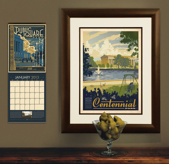
We have 2 lines of prints to promote for 2013. One is a labor of love for our community—a Metro Parks calendar full of 13 prints that celebrate Nashville’s parks and public green spaces. In addition to the calendars, we have also created ready-to-frame prints, and a 22-piece postcard set so that folks can own all of our parks designs in a compact format.


Our other 2013 calendar promotes our new World Travel Collection—prints that feature romantic destinations from all over the globe. ADG’s founder Joel Anderson assembled a team of young local artists, (all graduates of Watkins School of Art, Design and Film) to help him create the art in this new print series. They include Michael Korfhage, Andy Gregg, Julian Baker, Shelby Rodeffer, Rion Nishimori, and Ligia Teodosiu.

This new World Travel calendar features 13 different 11" x 14" prints that can be framed. They are all adapted from the ever-growing series of World Travel gallery prints. And for anyone short on wall space, we have also made a 24-piece postcard that features mini versions of all our 2012 World Travel prints.


We are giving a limited number of our latest 2 calendars to our clients as gifts (while secretly promoting our skills and enticing them to send us more biz.) We have also reserved a limited supply of calendars to sell on our web site. They make great gifts... so get yours while supplies last!

Happy Holidays!