Monday, February 17, 2014
Friday, January 31, 2014
Pressers Playing Cards
Last year we were approached by Ellusionist, a company that makes playing cards and instructional videos for magicians. Wanting to branch out with the look of their cards they looked to us to create a vintage deck of cards based in 60s advertising. They were inspired by the hit TV series Madmen and we wanted to give them something that felt at home in that era of design.
Illustrator Aaron Johnson always has an ace up his sleeve. His first set of sketches left the client speechless.
The card backs probably had the most time devoted while we explored different looks to fit the art style. Aaron probably made over two dozen!
Thankfully the look of the Court cards (Jack, Queen, King) was decided early on. From that point on it became a matter of rendering out all twelve of them. They had to interlock perfectly so that when viewed from either top or bottom the design would mirror itself.
This is the part where we typically show in progress shots of illustration but instead we pulled something new out of our hat. It's a video!
After a lot of illustrating all twelve court cards plus the ace and joker were finished. We suspect Aaron is secretly a smartly dressed robot.
With all the cards done we turned it back over to Ellusionist who made their own tweaks and finished out the box packaging. Take a look at the finished deck!
You can purchase a Pressers deck for yourself here on Ellusionist's website!
Thursday, January 16, 2014
2014 Southern Hospitality Wall Calendar
Each year, we partner with McQuiddy Printing and one of our favorite paper companies to produce a promotional calendar. These 3-way promotions are an affordable and fun way to create a very nice piece that would otherwise be too costly to produce. The printer contributes their printing services, the paper company contributes paper, and we contribute our illustration and design services. Then each company has a nice stack promotional calendars to showcase our products and skills.
The 2014 Southern Hospitality calendar is full of Southern sayings, expressions, wit
and charm. It also features 13 ready-to-frame prints that we created for
our Southern Delights poster collection.
And if you are not a design client, don’t worry, you can still get your hands on a calendar for only $19.99 by visiting our site. (What a deal—if you bought 13 prints from our web site, you would spend over $240!) We only created a small batch of calendars to give away, and an even smaller batch to sell. So get yours while you can!
Thursday, January 2, 2014
Holiday Packaging
As designers and brand consultants,
Christmas usually starts early for us—like in the spring or summer! Our
clients who produce products that will sell in December need to start
the work months in advance. That means we have to get into the holiday
spirit at odd times! It is not too difficult if we crank up a play list
of x-mas music while we sample the product we are working on. We had a
chance to do that for 3 different clients this year:
Williams-Sonoma Deluxe Peppermint Bark Packaging:
Our friends at Williams-Sonoma’s design department call us up every now and
then, asking us to help out with special packaging projects. We got a call in the
summer of 2013 to help them create a special-edition 15th Anniversary
Peppermint Bark Package for the holidays.
The challenge was to get into the holiday spirit while it was 85 degrees outside and create an ornate, festive package design that payed homage to previous collectible tins from the last 15 years. (Each year, Williams-Sonoma creates a new collectible tin for their delicious peppermint bark candy.) For this special occasion, they wanted us to help them create a large, flamboyant tin (containing enough bark to feed 20 people!) We experimented with a variety of colors, fonts and layouts.
Staff designer Ligia Teodosiu and Creative Director Joel Anderson
went to work on a few different design options. The one that was picked
had some fancy hand-lettering and lots of classic detailed
engraving-like art. We got a sample of the finished product and ate all
the peppermint bark within a few days. Christmas definitely came early
this year!
Sparkle Bark Packaging:
Of course, not every
client develops their products 6 months in advance—a lot of
smaller entrepreneurs have to move a lot more quickly—especially when an
idea hits them just a few weeks before the holidays! The Bang Candy Company makes quirky, delicious artisan chocolate. Founder Sarah Souther called in a panic, asking us to help her create a brand look and a package for her latest holiday confection called Sparkle Bark. The print-ready art had to be done in less than 2 weeks. We jumped into action and designed a label that would showcase her amazingly delicious pink and dark chocolate topped with peppermint candy, glazed with edible glitter and finished off with pop rocks candy. She added a sparkly ribbon to give the entire package a festive, artsy holiday vibe. We ate lots of the candy and remarked that every bite tasted like a Christmas party in your mouth... and of course, that line made it onto the package—free of charge!
Check out Bang Candy Co.
Roast, Inc. Holiday Packaging:
A fantastic Nashville-based coffee roasting company asked us to create a special holiday gift tin for their delicious whole beans. The label needed to celebrate Christmas in Music City. It also had to sell their coffee, and be so attractive that customers would want to keep the tin and display it for years to come as jolly holiday kitchen decor.
Since we only had 3 weeks, we drank lots of coffee and designed like deranged elves. We delivered on time, and while we were at it, we created some other non-holiday labels based on art from our Coffee Collection poster series. These new collectible tins will be swanky gifts for other occasions all year long!
Visit the 8th & Roast Facebook page.
Thursday, December 19, 2013
Wednesday, November 13, 2013
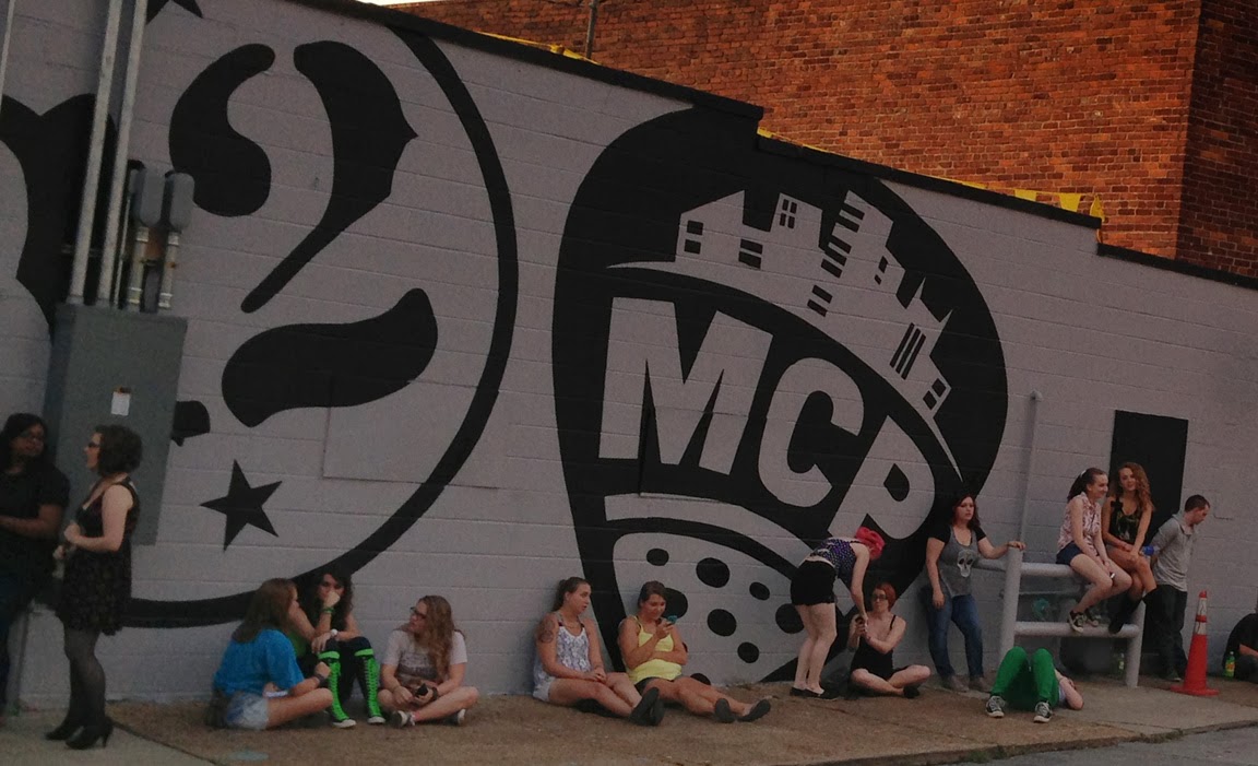
Music City Pizza: Branding & Packaging
Several months ago, a tasty project came our way—and we could not wait to sink our teeth into it! The client wanted to renovate a popular Nashville performance venue called 12th & Porter and open a pizza restaurant next to it. (Pure genius—when people line up outside the venue, they will smell the pizza while they are waiting to see a show—and of course, they are gonna want some!)
We started by creating a bunch of rough logo concepts. All our designers submitted options. (That is our favorite way to create a logo—get everyone in the firm to cook up a few ideas and see which ones the client likes best.) Some logo ideas reminded him of heavy metal. Others looked like Hip Hop. Since Music City is about lots of different styles of music, the client settled on a logo that had more cross-over power. He chose an option that was part guitar pick, part slice of pizza. (The winning logo was created by staff artist Ligia Teodosiu.) After messing around with lots of color options, we chose black & gold—the branding for the 12th & Porter music venue was already black, and gold reminded us of yummy, gooey cheese.
After Ligia nailed down the logo, the team created a bunch of cool art that could be used to decorate and promote the joint. We wanted the graphics to represent several different musical genres. We started out using a lot of color. But as we experimented, we realized that many of our colors were not really food colors (thus, they were not very appetizing.) They were also too varied to serve as solid brand identifiers. So we slimmed down the palette to make the art more simple and bold fit the new brand look we had established.
The resulting designs created an artistic language that felt energetic, grungy, underground, hip and urban. This pile of art served as a great starting point for the menu design.
Creative Director Joel Anderson wanted to make the menus out of old double LP record jackets. The client liked that idea, but he wanted to create an album cover that was more about the new MCP brand. Staff artist Edward Patton stepped up and designed a killer LP record jacket. He made all the illustrations black and gold, and added lots of cool spray paint and urban graffiti touches to help the vibe look and feel like an underground music hot spot.The client hired a record company to print off several hundred units of the LP jacket. Edward used brass fasteners to install clear plastic sleeves on the inside of the LP jacket. Since the menu was destined to change a lot, the client would be able to print out color copy menu sheets and insert them into the plastic sleeves. (The idea was to make the menu easy to update without having to re-print the whole thing!)
After the menu was completed, Edward started working on the pizza boxes. The client wanted them to scream Music and Pizza. So Edward illustrated a turn table for the large box and a guitar amp for the small pizza box.
It’s
a good thing we created only 2 branding colors—most pizza box printers
charge a LOT more money to print multiple colors. So our saucy black
& gold branding scheme looked good and it saved the client a bunch of
dough!
Subscribe to:
Posts (Atom)