 |
| Photography by John Moessner |
When we visited Rahal Farms, we were impressed at how Michael’s animals are given the opportunity to graze and roam freely and live together as a community. They all interact and behave like one happy family! The goal of our branding would be to suggest artful, healthy, earthy farm-fresh goodness while keeping the happy animals at the forefront.
Our challenge in designing the logo was to create something that could work across a variety of platforms, from product packaging, to signage, to a future event space and teaching kitchen. This meant that it had to be simple, and we either needed to use one iconic shape or custom typography to express holistic farming in the most traditional sense. Throughout our exploration, we wanted to be sure the logo felt warm, welcoming, and even nostalgic. Below are several of our initial ideas, created by Ligia Teodosiu, the lead designer/illustrator on this project.

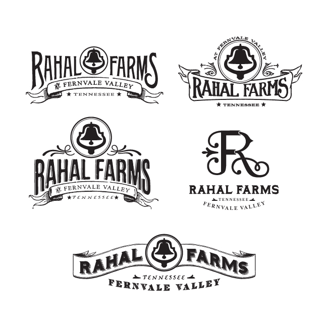
The clear winner became the logo that incorporated the "R" and "F" in a way that felt elegant, warm, and wholesome. From this we finished off the logo with earth-tone colors.

The simple design allowed us to translate
the brand to the many outlets of Rahal Farms. Below is an example of the logo
used as an extension of Rahal Farms, for The Kitchen at Rahal Farms:
Now that Michael had an evocative logo, he needed some packaging to boot. With his hens producing 400 eggs a day, we scrambled (no pun intended) to create an egg carton label so he could start selling his delicious farm-fresh eggs. He was looking for something that would really set his eggs apart on the store shelves and elevate his product above all others in the same category. It was back to the drawing board for us as we wrestled with the best possible way to sell his farm-fresh eggs.


After
several different attempts at establishing a look for the top of the
label, we finally settled on one we all felt was egg-ceptional and carried the same look throughout the rest of the label. We finished it off with warm colors and an egg carton that not only complemented the colors of our label, but would really stand out on store shelves.


The final label was printed on French Speckletone Paper in Cream Cordtone. We finished off the branding for Rahal Farms with some business cards, a letterhead and envelope, also printed in the same paper family.
Once we had finished the branding and packaging design, we worked with our favorite web designers to translate the printed branding into an engaging on-line experience. We hired John Moessner to shoot beautiful photos and produce a moving film about the farm. Then we asked Kelly Bainbridge to write some informative text, and guide the process to create a web site that not only informs, but inspires people who love healthy, holistic farm-fresh products. (Ryan Pflasterer with www.BehindTheMule.com and William Donnall with www.SodiumHalogen.com did a fabulous job building the www.RahalFarm.com site!)

