Here's a sampling of the logos we’ve created since our last review (in no particular order). Some of them have our concept sketches included; we often have several good options leading up to to the final design and it would be a shame not to show them!
Collette Lash Photography:
We got a call from a talented photographer who loves to create magical stories each time she works with a client. Her work has an aura of nostalgic Americana and often looks like it was shot decades ago in the golden age of Hollywood. Collette asked us to create a brand mark that looked like her unique style of photographic storytelling. Check out her artful photography.
Designer: Ligia Teodosiu
J. M. Thomason Spices:
The Doug Jeffords Company is a family-owned commercial seasoning and spice manufacturer established in 1961. One of the family members contacted us to talk about creating new branding for J.M.T., a sub-brand of retail seasoning blends. We created the logo and the packaging for the line of spices. We gave the logo a classic vintage look to convey the company's history and expertise. They liked it so much that they asked us to redo the Doug Jeffords logo in the same style! (That new logo is still in the works.) Below is the primary J.M Thomason logo along with an alternate logo seal that we used on the front of the packaging. Check out their awesome line of products.
Designer: Ligia Teodosiu
Lakeside Maple:
Lakeside Maple started selling their gourmet trail mix at local markets. When their business outgrew the hand-applied labels it had been using, they turned to us for a more commercial packaging that still kept their artisan feel. This logo combined illustration with hand-lettering to bring out the earthy vibe that suggests all natural food. Take a look at their Facebook Page!
Designer: Aaron Johnson
Hope Clinic for Women:
After a few decades in existence, a Nashville-based crisis pregnancy center was getting ready to celebrate another big anniversary. They called us to help them completely overhaul their branding to reflect the next decade. We chose 3 colors in the logo to reflect 3 areas of service the clinic provides:
Yellow for Prevention, Teal for Counseling, and Pink for Pregnancy. The flame represents Hope and Light for people facing tough times. They took our branding and applied it to their web site, brochures, stationery, signage and more. Check out the overall effect at their site.
Designer: Ligia Teodosiu & Joel Anderson
Switters:
Our clients called us as they were getting ready to open Nashville’s first iced coffee microbrewery. Our assignment was to create their branding and packaging for 2 new flavors of bottled iced coffee. (Their product is super high-quality, produced in small batches, and intended for serious coffee lovers!) We had a blast getting jacked up on caffeine and creating these logos. Check out the Switters Facebook page!
Designer: Joel Anderson
Fat Bottom Brewery:
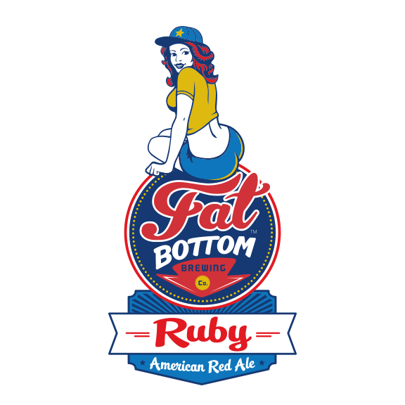
Continuing our branding for Fat Bottom, this year we added two new logos and retooled the old ones. Once the girl on the old Ginger logo became the mascot for the brand, they asked us to create a new girl to represent Ginger. Knockout IPA is the newest addition to the lineup. (Heads-up: Knockout and Ruby will be the first two in a line of canned brews to be released later this summer!) We ended up updating the old logos to all have the same circular emblem to help keep the brand identity consistent across a variety of packages and uses. Check out their site!
Designers: Aaron Johnson, Andy Gregg, Joel Anderson
Whole Approach Business Coach:
Morgan Bultman coaches business owners on how to run a successful operation and stand out in their field. Part of improving a business means knowing who to turn to for a good logo. Originally the client wanted a logo that was more earthy and vintage looking, but in the end we found a happy medium that related more to a business while still having an element of earthiness.
Designer: Edward Patton
KerriA Designs:
A talented jewelry artisan asked us to create a logo for her. She makes beautiful hand-made, earthy and organic-looking necklaces, earrings, etc. We used earth tones and rendered an artsy, creative, and stylish logo to match her products.
Designer: Ligia Teodosiu
Old Glory Distilling Company:
Fine spirits take time to mature and a master distiller has to be good at planning ahead. Matt Cunningham knows how to plan two steps ahead and the extra time we had to devote to his packaging and branding really paid off. Playing on the history of their location and the old glory nickname of the American Flag, this colonial-looking logo is designed to integrate well with their packaging. Follow their progress as they build their distillery!
Designer: Aaron Johnson
Capitol Theatre:
Capitol Theatre is a classic movie theatre retrofitted to host events, weddings, theatre, and of course movies. Their building and interior have an art deco era look and we wanted to convey that classic movie theater vibe in the logo. Check out their space and events!
Designer: Aaron Johnson
Merch Mania:
This client asked us to create a logo for his promotional merchandise biz. He puts logos on cool stuff like shirts, hats, pens and those thingies that keep your beer cold. His products are intended to make a statement and get a brand mark noticed. We created a logo fusing 2 Ms together to make an exclamation point. Then we used some punchy eye-catching colors to make sure his logo gets noticed!
Designer: Edward Patton & Joel Anderson
That’s all for now. We have some other cool logos that are in the works, but until the products hit the market, we are sworn to secrecy! We look forward to showing off more branding whenever we can get around to it. Until then, keep it creative!


