Thursday, March 28, 2013

Lane Motor Museum Poster


When we got a call from Lane Motor Museum asking if we could do a Spirit of Nashville poster we jumped at the chance. Being a fan of all things vintage we took a field trip down to the museum, cameras in hand.

Established in 2002 by Jeff Lane, the museum started with his personal collection of cars that he had bought and restored. Finding a swag location in the former Sunbeam Bakery at 702 Murfreesboro Pike, Lane Motor Museum unveiled it's collection to the public in 2003. One of the few museums specializing in European cars, Lane maintains all it's vehicles in running order. Great care is made to restore each vehicle to near-original specification. With 40,000 square feet and full of cars, there's a lot of history to be seen.

Illustrator Aaron Johnson drew inspiration from the style of old Monaco racing posters, many of which hang in Lane Motor Museum.


Aaron drew some dynamic scenes with cars from the museum. He started with rough concept sketches that we presented to the client with 3 different options for layout, cars, and style.


After settling on a single concept, we presented them three more options for typography and borders.


With the borders and typography figured out, we went back to the museum to shoot specific reference photos to get the right perspective and accurate details on the cars.


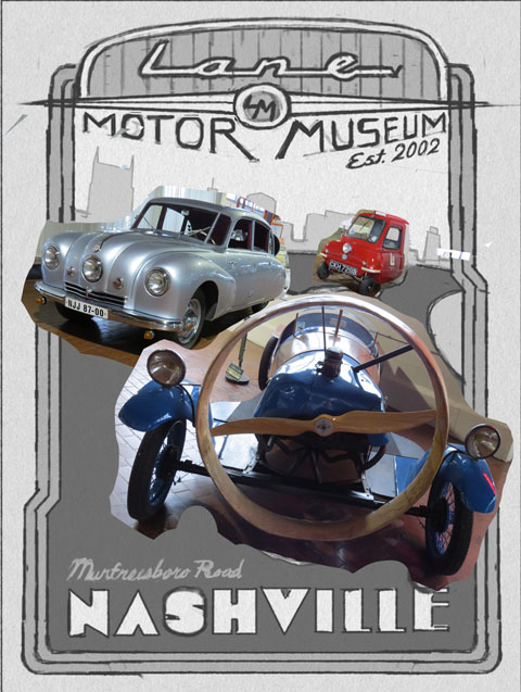
Aaron then set out to render the poster in all it's glory, starting with the cars and working outward.


After all the handrendered type was done and all the elements were in place it was just a matter of finding the color scheme that fit the best and represented the cars well.


Now Lane has a new piece of chrome to show off in their museum, and we have a new car poster to add some bling to our Spirit of Nashville poster collection!

This print will be for sale in Lane Motor Museum’s gift shop in a few weeks. Meanwhile, you can see the print and framing optons at our Spirit of Nashville site.


Thursday, March 21, 2013

New Dr. Pepper Hour Poster


A few months ago we were approached by Baylor University to create a poster to promote their Dr. Pepper Hour; an event that has taken place on campus each academic week for the past 60 years! What started as an informal gathering of students and teachers in 1953 has become a longstanding tradition. Dr. Pepper Hour, formerly known as Coke Hour, is held every Tuesday between 3pm and 4pm. Students, faculty, and staff come together and socialize while enjoying a refreshing Dr. Pepper float. 


To commemorate the early beginnings of this special tradition, we knew we wanted to create something that felt appropriate for that time period. Yea, you guessed it, we went retro 50's! As usual, we started out sketching until we came up with three ideas that felt retro, light-hearted and whimsical (what's more fun than Dr. Pepper floats, right?)
Once the client picked a favorite, we created final art. Taking cues from old matchbook illustrations, we created a design that would work well in a limited color palette and simple shapes. After we finished the art, we used a little photoshop magic to give it a rough, screen-printed look. The final design was printed at 20x15.


Friday, March 15, 2013

Mère Bulles Art Nouveau Poster Design

This week we added an interesting new illustrative style to our Spirit of Nashville Collection. Mère Bulles (pardon our French) translates to Mother Bubbles—it’s the name of a popular restaurant in Brentwood Tennessee.  


So why all the French? Mère Bulles history begins with its muse, Mother Bubbles, who was the granddaughter of the original owner. Born Michele Bouvier around 1840 in Deauville, France, she eventually grew to become the belle of New York and later opened a popular restaurant in Charleston, S.C. One thing that Michele loved was champaign, earning her the nickname "Mother Bubbles," which in French translates to Mère Bulles. 

In 1985 Mère Bulles opened on Second Avenue in Nashville, which was once the old Maxwell House Coffee Warehouse. The atmosphere of the restaurant was inspired by Mother Bubble herself: lively, welcoming, and entertaining. The original Mère Bulles was instrumental in the revitalization of of the now vibrant Second Avenue and Broadway district of Nashville.  

In 2000, Mère Bulles moved to Maryland Manor, a historic plantation-style farmhouse and former horse-breeding estate in Brentwood where it now plays host to dinners, meetings, and events. Mère Bulles is a place of comfortable elegance; a casually elegant restaurant without the hour-long wait for a table. The cool combination of history and swankiness makes it a perfect candidate for our Nashville collection. 

For this poster we wanted to work in the style of Art Nouveau, particularly the work of Alphonse Mucha. The style gave is the the perfect vintage look to show the historic side, and to play up the influence of Mother Bubbles. Starting off with rough concept sketches, illustrator Aaron Johnson sought to find a focus between Mother Bubbles and the restaurant itself. 


We eventually settled on Mother Bubbles as the main focus, with the building below. Aaron then set out to make a more detailed rendering based on that composition. 


Ever resourceful and not one to skimp on the details, Aaron went as far as to make a paper champaign glass and do sexy poses in the mirror to get the hand pose right.


With the composition in place and the wording set, Aaron set out meticulously rendering the details in a way that would look true to the Mucha style.


Once all was said and done we had a new poster that will add some of that lively Nouveau style to our collection and spice up the already hip atmosphere of the Mère Bulles restaurant. 

Prints are available for purchase at the restaurant or on our Spirit of Nashville site.
Just visit this link and click PRINTS to see the art and framing options!


Monday, March 4, 2013

2013 ADDY Awards

After being cheapskates by only entering 3 campaigns in the 2013 Nashville Advertising Federation ADDY Awards, we still ended up winning 4 ADDYs.

The ADDY Awards are held every year to recognize outstanding advertising and design in the greater Nashville area. Winning entries go on to the regional ADDYs and then on to the national ADDYs. Even though 3 of the awards were GOLD ADDYs, we didn’t win any actual gold.  As always, they turned out to be fancy glass paper weights, that were awarded to us for the following projects:


Gold ADDY for the Ram Truck Posters/Postcard series: We were hired by The Richards Group in Dallas, TX to create 6 posters for Ram Trucks that had the look of old WPA National Parks posters. Our pals at the Richards Group took our illustrations and made some fine print ads and 4-story tall wall-scapes, too! Former ADG staff artist Andy Gregg worked on this before he moved to Chicago. Way to go, Andy!


Gold ADDY for our Anderson Design Group self-promotional posters, postcards, and calendar: We created 13 posters to celebrate Nashville’s beautiful Metro Parks. Then we created a calendar and postcard set for everyone who doesn’t have room for 13 large posters on their wall! This series of posters, calendars and postcards all was printed by McQuiddy Printing. Nice job, guys!


Gold ADDY & Best of Show ADDY for Denny’s Tour of America menu art, postcards and posters: We were hired by Erwin Penland, the Denny’s Restaurant chain’s ad agency to create art for their summer Tour of America menu. Everyone liked the menu art so much that they asked us to create gift items—so we produced a 7-poster series and a 14-piece postcard set. Apparently, the judges for the ADDYs liked them enough to add an extra trophy to the trove—the treasured Best of Show Award for the whole Print Category.


We were satisfied that our entry fees paid off—even if we didn’t haul off any 14 karat gold that we can turn into bling. We got kudos from our peers, along with some stylish glassware that will be ideal as doorstops, prisms, self-defense weapons, paper weights—and street creds.