
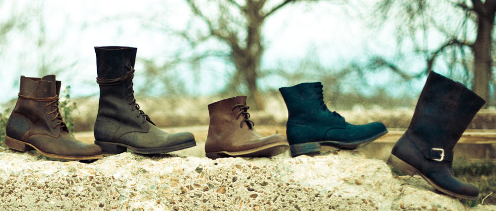
Over a year ago, a stylish entrepreneur named Phillip Nappi contacted us to share his vision for a new artisan boot and shoe company that would honor his Italian grandfather’s legacy through hand-crafted boots, bags and other dry goods. Inspired by patterns of 100-year old boots, Phillip worked with a team of artisans in Italy to produce prototypes for a full line of boots and bags.
When we first saw the boots, we were convinced that this line of leather goods would be a smashing success if the branding & marketing materials could tell the story. Creative director Joel Anderson loved the boots so much that he insisted on being the first customer in the world to own a pair of Peter Nappi boots. As soon his boots were delivered, he knew this branding project was going to be a labor of love. (Joel likes to be a consumer of the products and services he and his team promotes—this ensures an immediate connection and a real-life experience as a member of the target audience.)


We joined forces with John Moessner, a great young film maker and photographer. We also partnered with Cabedge, an amazing web site development firm based in Nashville, TN. With our logo & brand development, John’s film and photography, and Cabedge’s web site building capabilities, we created all of the essential components needed to define the brand and launch this new company in style.

We started with research and sketching. Our logos needed to feel like they were created 100 years ago. So we poured over old tobacco tins, catalogs, antiques, ads and poster art from the early 1900’s. We kept in mind that our logo and branding art had to tell the story of an Italian shoe maker who immigrated to the USA and passed down a legacy of art and craftsmanship to his grandson. We sought to represent the quality, beauty, comfort and style that makes these beautiful $700+ boots and bags worth every penny. After several rounds of rough logo concepts, we arrived at a clean, simple logo based on the signature of Phillip’s Italian grandfather (taken from copies of his Ellis Island immigration papers.) The resulting logo seemed to fit the vision and the brand perfectly.


Once a logo was finalized, ADG designers Ligia Teodosiu and Edward Patton started creating a comprehensive style guide that dictated colors, fonts, backgrounds, patterns, etc. necessary for creating the packaging, hang tags, press releases, and a comprehensive book that would tell the Peter Nappi story and showcase the products. Joel and Ligia consulted with Cabedge to help make the web site look like a natural extension of the printed materials. Phillip and Dana Nappi already had a very keen vision of how to create the perfect showroom via colors, textures, materials, props and furniture they collected from Italy and other places. As the creators of this line, they brought their own sense of color, mood, style and story to every aspect of the project, making the whole campaign a true team effort.


The Peter Nappi web site (built by Cabedge) conveys the essence of the Nappi brand via a film created by John Moessner. The site showcases all of the products, makes ordering possible, and offers a virtual tour of the Peter Nappi showroom via John’s awesome photography.


Overall, this branding project is a great example of what happens when experts collaborate, guided by a branding strategy that ties everything together and keeps everyone “reading off of the same page.” The Nappis couldn’t have been more pleased with the results. And neither could we!
You can tell by the attention to detail that this was a labor love. Congratulations! Another homer.
ReplyDelete