We just wrapped up a poster project for the Baton Rouge Area Convention and Visitors Bureau. The piece was commissioned by Zehnder Communications, a Louisiana-based advertising firm. The people at Zehnder had seen our Art & Soul of America poster series and wanted us to do a hip, vaguely retro poster that would highlight 10-12 Baton Rouge landmarks/tourist attractions. This would be part of a larger PR campaign to get both tourists and business leaders to come to Baton Rouge.
Here is a break-down the creative process to reveal the anatomy of a poster design from start to finish:
First, we started with some embarrassingly rough sketches. Zehnder picked the second thumbnail. The "Go BR" type is the name of the larger campaign, but this was eventually changed to "Baton Rouge - Red Stick" for the poster.
Next, we cleaned up the sketch.
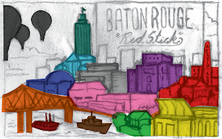
Then we added color to the rough to give the client an idea of what we were leaning toward. We have an affinity for bright colors that occupy a gray area between cheap, retro printing techniques and a post-modernist pop aesthetic. We went with the colors pictured above. Thankfully the people at Zehnder liked them.
They had us rearrange the buildings a bit, and we sent them this color-coded sketch just to keep clear which landmarks are which.
We then produced the final vector art, sending Zehnder updates as we went along. Surprisingly, buildings and landmarks stayed in pretty much the same places they occupied in the rough sketches. This never happens.
Finally, we brought the vector art into Photoshop and rounded off edges, added airbrush shading, and generally dirtied up the art a bit for a more organic, screen printed feel. A border was also added with the old "Visit Baton Rouge" logo in the corner.
The guys at Zehnder seemed pretty happy with the final art. Apparently, the art will eventually be used in an interactive mini-site to promote the city of Baton Rouge, so keep your eyes peeled.


This is so pretty! I LOVE your style and every poster I've seen of yours.
ReplyDeleteThere are certainly a lot of details like that to take into consideration. That’s a great point to bring up. web design baton rouge
ReplyDelete