We've been working on the first six posters for the Spirit of Franklin/Leipers Fork Collection, but six more are still undecided. We plan on having the a total of twelve done by summer, so don't forget to contact us on Facebook (or comment below) soon and let us know which Franklin landmarks you would like to see poster-fied!
The first six are (at least for now):
Franklin Town Square
Battle of Franklin
Franklin Theatre
Carnton Plantation
The Factory
Leipers Fork Downtown
Below are some of the thought process/development on the Franklin Town Square poster.
After starting with the color thumbnail we created the type treatment. This was a little difficult to work into our traditional poster format, so we adjusted it a little.
We also colored it. Often we create the typography first to set the tone and color palette in a poster. The type is a bit easier to control than an entire landscape.
We first worked on the foreground "hero" object(s) that will be the focus of the poster. In this case we're looking at the Civil War Memorial obelisk at the center of downtown Franklin, along with one of its four corner canons. The halftone dots we applied early on to the canon were eventually removed.
The art went through multiple color iterations. The one on the left felt too monochromatic (and pink!), but the blue/green didn't feel right either. We eventually went with something more true to the original thumbnail palette.
Finally we shifted around some of the typography and adjusted the colors a bit more, and now it's ready to work on in Photoshop. We'll post the final version here soon.
Here is a not-quite-finished Factory idea that our fantastic intern, Vanessa Baker, has been chiseling away at.
Anyway, keep those suggestions coming!
Monday, February 28, 2011
Thursday, February 24, 2011
ADG Intern cleans up in the Student ADDY Awards
Well, it's about that time of the year again. While last weekend, we were able to take part in the ADDY Awards for professionals, this week, the Student Addy's took place. Between those two, we've been doing a lot of celebrating! Our very own intern, Vanessa Baker, was among the night's biggest winners, taking home 3 gold awards and one silver! Way to go Vanessa! You can check out more of her award-winning work here.
Monday, February 21, 2011
ADG Wins Big at 2011 Addy Awards!
This past Saturday was a windfall for us at the Nashville Addy Awards, picking up five awards (one best-of-category, three golds, and one silver) in four separate categories.
 |
| Art director Joel Anderson and bottle/poster designer Andy Gregg hittin' the sauce. |
We won a gold in the Packaging Campaign category for Hog Heaven's BBQ Fight Club sauce bottles, as well as a silver for the BBQ Fight Club promo posters.
We also won a gold in the Self-Promotion category for our 2011 Art & Soul of America Calendar. This was an especially taxing project for us, so this was a nice vindication of the team's efforts.
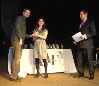
The big win for us last night though was both the gold and the 'Best-of-Category' awards being given to Joel on stage in the special Flood Relief category. The awards were given for the two Spirit of Nashville flood relief posters he designed, in conjunction with donations from Athens Paper and McQuiddy Printing, to help raise money for flood relief. (Over $32,000 was raised last year!)
Below are some pics, mostly of us mugging, from the event.
 |
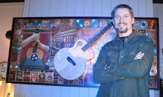
| Joel with his guitar collage piece. This artwork will eventually be auctioned off to help raise additional flood relief funds. |
 |
| Andy with the 2011 Art & Soul of America Calendar. |
 |
| Joel Anderson with wife, Patty. |
 |
| Andy with girlfriend, Alexis. |
Friday, February 18, 2011
The Importance of Office Clutter
It’s important to be organized, but certain kinds of clutter are actually good for creativity and productivity. Take a quick tour around our design firm to see what we mean.... We’ll start in the entry way. It’s pretty clean, but we have strategically placed clusters of trophy clutter to say to our clients “yeah, these guys have street cred.”
We also litter our walls with framed examples of cool design work we’ve done. It decorates the walls and serves as a portfolio to show off some of our favorite projects.
We have a shelf that is also full of stuff we have designed. When clients come in, we can pretend like we are really busy, so while they wait, they can wander around and browse. This lets them see more of our work without us having to whip out the portfolio.
If we really take our time, they might wander over to our book shelf and see a collection of awesome pop culture icons. All of these figures represent the icons of American art and entertainment...each of these characters started out as a drawing but through marketing and design, they became famous symbols of American bliss. From Charlie Brown to Sponge Bob to Mickey to Scooby Doo and Bart Simpson... these pop culture treasures are not only fun to have around, but they suggest that we are in touch with what is fun and cool. (If clients think you’re cool, they will not tell you to make their logo as big, or use colors like mauve in their brochures.)
If we totally ignore our clients while we talk real loud on the phone to clients from New York and LA, they might feel like they have the right to snoop around. We want them to see our inspiration wall. It is full of cool stuff that we wish we had designed. There are a few of our pieces on there, too... but this magnetic board is there to inspire and push us to compete with creative folks who we admire. If the client thinks we did everything on that board, they might think we are not just hip, but uber-cool.
We also leave out mood boards. These are collages that feature research that we have done to nail down a specific vibe that is in the same cultural zip code as a logo, package or brand we’re creating. This is all part of our creative process, but by leaving it out in plain view, our clients think we must be super busy, so they will understand why we can’t get up from our desks just yet. (Never mind that the mood boards are from a project we finished 6 months ago!)
If the clients get really tired of waiting for us to come and say hello, they just walk right into our design area. By doing this, they fall right into another trap. They must pass more trophies like our Emmy, our Dove, and loads of ADDYs.
They inevitably stop at our Super Hero Collection and ponder how we actually get anything done with all the toys we keep around us.
Then we look surprised to see them and apologize for making them wait, muttering something about being lost in our creativity. They can feel the creativity swirling all around them, and they quickly forget that we’ve squandered 15 minutes of their day. Now that we are all standing around our computers, they can see that we actually made their deadline and created some butt-kickin’ design work that will get them a promotion if they make it look like it was all their idea. We encourage that. It usually leads to more work. (Like Ronald Reagan said, “It’s amazing what you can accomplish if you don’t worry about who gets the credit.”)
When we’re done hanging out with them and thanking them for the great feedback they have given us, we let them exit through the gift shop. (It used to be a conference room, but we turned it into a boutique to sell stuff we have created.) It’s full of our Spirit of Nashville and Art & Soul of America prints and gifts. Often, they buy something, and leave feeling happy.
See Mom? Our clutter is actually a god thing!
Wednesday, February 16, 2011
A Behind-the-Scenes Look at Poster Design
We just wrapped up a poster project for the Baton Rouge Area Convention and Visitors Bureau. The piece was commissioned by Zehnder Communications, a Louisiana-based advertising firm. The people at Zehnder had seen our Art & Soul of America poster series and wanted us to do a hip, vaguely retro poster that would highlight 10-12 Baton Rouge landmarks/tourist attractions. This would be part of a larger PR campaign to get both tourists and business leaders to come to Baton Rouge.
Here is a break-down the creative process to reveal the anatomy of a poster design from start to finish:
First, we started with some embarrassingly rough sketches. Zehnder picked the second thumbnail. The "Go BR" type is the name of the larger campaign, but this was eventually changed to "Baton Rouge - Red Stick" for the poster.
Next, we cleaned up the sketch.
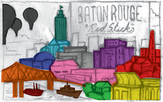
Then we added color to the rough to give the client an idea of what we were leaning toward. We have an affinity for bright colors that occupy a gray area between cheap, retro printing techniques and a post-modernist pop aesthetic. We went with the colors pictured above. Thankfully the people at Zehnder liked them.
They had us rearrange the buildings a bit, and we sent them this color-coded sketch just to keep clear which landmarks are which.
We then produced the final vector art, sending Zehnder updates as we went along. Surprisingly, buildings and landmarks stayed in pretty much the same places they occupied in the rough sketches. This never happens.
Finally, we brought the vector art into Photoshop and rounded off edges, added airbrush shading, and generally dirtied up the art a bit for a more organic, screen printed feel. A border was also added with the old "Visit Baton Rouge" logo in the corner.
The guys at Zehnder seemed pretty happy with the final art. Apparently, the art will eventually be used in an interactive mini-site to promote the city of Baton Rouge, so keep your eyes peeled.
Thursday, February 10, 2011
Our Package Design—Featured on CBS and Martha Stewart’s Blog!
Our friends at Olive & Sinclair have been showing up all over the place lately. (And thus we are too!)
" . . . aren't they lovely?" "We all gobbled them up {de-lish!}, but not before admiring the chic packaging . . ."
Last week Olive & Sinclair chocolate bars turned up on CBS's The Early Show as part of a segment on unique Valentine's Day Chocolates. Though the co-host was a bit picky, we thought the feature was still pretty cool. Also, notice how the generically packaged, neighboring chocolates get passed over entirely without any camera time at all. This is the elusive power of fun design.
They also turned up on the Everyday Food Blog at MarthaStewart.com. We felt the love too.
"I picked some up out of curiosity – such a cute label! – and loved what I tasted."
Finally, Olive & Sinclair even turned up as Christmas gifts sent out by Goop, Gwyneth Paltrow's lifestyle site. Again, we were left feeling like we had done our jobs.
" . . . aren't they lovely?" "We all gobbled them up {de-lish!}, but not before admiring the chic packaging . . ."
Cool Opening Credits Typography
This caught my eye - how could it not? Enter the Void is a French film directed by Gaspar Noé and is described as a "psychedelic melodrama" (according to Wikipedia) that takes place on the neon streets of Tokyo. I haven't seen it.
What piqued my interest as a designer though were the title credits that I found posted on Youtube. It seems that every person of any status involved in making the film got their own personal logo /type treatment in the manic, febrile opening credits. Some of the type stays on screen for less than a second - that's a lot of design mileage!
It's cool too because the type seems evocative of a very specific time; that is, maybe mid-to-late 1990's (though the film was made in 2009). This would be in keeping with the intense rave music as well. Are we seeing the very beginnings of 1990's cultural nostalgia? I suddenly feel old...
Anyway, enjoy.
Friday, February 4, 2011
Tuesday, February 1, 2011
Be a part of our NEW print series (coming soon)—The Spirit of Franklin!
Our Spirit of Nashville Collection now features over 70 limited edition prints that celebrate the history and charm of Music City. We’ve covered a lot of themes in Nashville, but we have not had a chance to venture very far outside our city limits to depict other worthy landmarks and themes. A lot of folks have asked us to create art that features scenes from Franklin and Leiper’s Fork, TN.
So in response to these requests, we have decided to create the Spirit of Franklin Collection. Created in the same style as our Spirit of Nashville Collection, we plan to introduce 12 new limited edition print designs in 2011. We’ve already started work on 6 designs, and we are looking for feedback from folks like you to let us know what other 6 designs we should create to complete the 2011 series! Keep checking this blog for a behind-the-scenes look at the prints in progress. We will update it several times each month with photos, sketches, and other behind-the-scenes tidbits. As you follow our progress, you’ll see how we create these prints—from initial sketches to finished illustrations!
We’d love to hear your ideas and suggestions for new Franklin or Lieper’s Fork poster themes. Visit our Facebook page and post your suggestions for your top 6 poster themes. They can be landmarks, festivals, places—anything you love about Franklin or Leiper’s Fork—anything that defines their rich history and charm. We will create 6 new designs for the Spirit of Franklin Collection based on the feedback we get here on our Facebook page, so please tell everyone you know to chime in!
Fighting for Attention
An update: ADG has made it to The Dieline (again) for our BBQ Fight Club sauce bottle packaging! Check it!
Subscribe to:
Posts (Atom)


 )
)


