Friday, December 5, 2014

Nathan East CD Package Design


We don’t do as much music package design as we did in the old days. (When we opened our firm in 1993, almost 80% of our design work was done for record companies.) Album cover design was a big reason why the design scene in Music City became so vibrant. During our first several years, we did hundreds of Country and Gospel covers for Capitol records, DreamWorks, EMI, MCA, Benson, StarSong, and other labels. Since then, the whole music biz has changed a lot. When budgets kept shrinking, we moved on to doing original poster art, branding and other adventures in design.

Several months ago, we got a call from Yamaha Music asking us to create the CD packaging for Nathan East. He is probably the most famous musician that you might not know. In addition to being a fabulous bass player, composer and all around musician, he has recorded, performed and co-written songs with performers such as Eric Clapton, Michael Jackson, Joe Satriani, George Harrison, Phil Collins, Stevie Wonder, Toto, Daft Punk, and Herbie Hancock.


We assigned the job to our in-house design star, Edward Patton who totally got into the groove. After looking through hundreds of photos, he settled on a few choice images and enhanced them with painted textures, marrying the imagery with typography, making the whole vibe look a lot like the how the music sounds.


The resulting package design was one of our favorite projects ever. As cool as this album cover looks, the music is SO much better! We highly recommend that you rush out and buy a copy of it right now.

Thursday, November 6, 2014

Fat Bottom Brewing Co. Packaging and Posters


It's time for us to pin-up our latest packaging design (pun intended.) We worked on branding for Fat Bottom Brewery a couple years ago, starting with the logo art, which evolved into having a unique female character to match the personality and flavor profile of each beer. Fat Bottom founder Ben Bredeson has worked very hard to build the brewery into a true Nashville original. His East Nashville brewing company and tap room has been kicking booty ever since it opened over 2 years ago. Today, demand has increased to the point where he needs to start packaging his 2 most popular flavors for sale in stores.


After requesting as many samples as we could justify (for research and inspiration, or course,) we asked our in-house illustrator and designer Aaron Johnson to retool all the character art to better fit the vertical format of a beer can. While we were at it, we added a couple new characters for the ever-growing lineup. From the beginning, our challenge with this branding scheme has been to create a nostalgic American vibe that conveys old-fashioned craftsmanship and good times. With that in mind, we set out to render character art that looked like the pin up girls featured on World War II airplanes. Our stylized women needed to be fun, sassy, and unique—sensual, but not inappropriate—just the kind of girl that would give a soldier a reason to stand proudly, work hard, celebrate the good times, and hurry home after serving his country with honor.

Once all the pin up girls and flavor logos were updated, we began creating a branding scheme for a 5-color can and a 4-pack box.


The cans would be sold individually, and as a 4-pack in a cardboard box. So the can art had to communicate no matter which way it was turned on the store shelf. A bold color was worked into the background overlaid by a pin up girl resting on top of the Fat Bottom logo which was set over the flavor name.

Once the aluminum can designs were finalized, we created a packaging concept that would allow each square box to be stacked or displayed in a number of ways so stores could create different scenes or even an entire wall of Fat Bottom Girls. 

After the master packing concept was figured out, we hammered out the box designs for 2 different flavors—Ruby Red and Knock Out IPA. The beer boxes quickly became collector’s items—now avid Fat Bottom fans can build their own beer box walls or Fat Bottom Fortresses. (Just think of the possibilities!)

These swanky 4-packs can be seen on shelves in grocery stores around Nashville. 


With seven character designs finished, we asked Aaron to create a poster series that is now a part of  the Spirit of Nashville Collection. (We are always adding new Nashville-themed prints that celebrate Music City’s unique history and charm.) These lovely 18" x 24" and 11" x 14" prints are available for purchase on our site.


Check out Fat Bottom's website for more info:

Creative Director: Joel Anderson
Logo Designer: Ligia Teodosiu, Joel Anderson
Illustrators: Aaron Johnson, Andy Gregg, Ligia Teodosiu, Joel Anderson
Packaging Designers: Joel Anderson, Aaron Johnson


Thursday, October 16, 2014

Hauntings of Hermitage


It's the time of the year for Halloween themed posters, and this year we were fortunate to have the opportunity to make one. Our project began when The Hermitage asked us to redesign their logo to reflect their new direction. They wanted to rebrand the site as as Andrew Jackson's Hermitage and make our nation's seventh president more prominent in the name and logo.

Located in Middle Tennessee, Andrew Jackson's Hermitage gives tours that tell the story of how 1000 acres changed from frontier forest to Andrew Jackson’s prosperous farm, deteriorated into post-Civil War dilapidation and was finally rescued to its current state as a public museum and National Historic Landmark.
We started with the portrait of Old Hickory himself. Fun fact; the $20 bill is one of the most circulated pieces of currency in the world. This makes his portrait one of the most recognizable faces around. Illustrator Aaron Johnson came up with a few different ways to depict the iconic portrait based on classic paintings of Andrew. Once AJ had drawn a few AJs we all took a shot at different configurations.

The client picked a style they liked and Aaron finished it out in color. One of the challenges was making Andrew's signature more legible so that it can read well when seen at a glance. To accomplish this Aaron used letters from different scans of signature provided by The Hermitage. The client wanted a logo with the portrait off to the left, and we also created a centered version for use on their sign. 

The Hermitage hosts an annual Halloween event with rides. ghost stories, and a mystery trail. This year's theme was based on Edgar Allen Poe's classic horror stories, which are featured in the mystery trail. You can find our more about the event here. 

Aaron designed a poster that highlighted themes from the two Poe stories featured at the event: The Raven and The Fall of the house of Usher.


If you live near Middle Tennessee and haven't been to The Hermitage we recommend checking out their historic site or attending one of their events. Here's a link to their Facebook page. 


Monday, September 22, 2014

Switters Iced Coffee Branding & Packaging


We love coffee. And we love working with local artisans and small biz owners. So when we got a call from the folks at Switters about creating a logo and developing a band look for their new iced coffee product, the answer was as obvious as if you had asked “Does Juan Valdez have an overworked donkey?” We met with Kyle and his wife Sheri—two hip young entrepreneurs who really know their stuff about coffee—to find out how we could help them turn their dream into a reality.

After hearing about their passion for making amazing coffee, and after tasting some of their off-the-charts chilled caffeinated delights, we started working on rough logo sketches. We like to capture the essence of a brand in our initial concept sketches. A logo is like meeting someone for the first time... (you often make up your mind about them before you really even know them.) So a logo must give off the right first impression.

We started with sketches and then moved to tighter vector art, after a general direction was established. Several of us submitted logo ideas. This is how we work—as a team, we all brainstorm and throw in ideas. Each of us renders our own ideas and then we present the best ones to the client.

They happened to pick a logo concept by Joel Anderson (Anderson Design Group’s founder and Creative Director) so he was tagged with the honor of finishing out the brand mark.

After our friends chose a concept, we did a few more rounds of subtle tweaks, enhancing the brand mark by degrees. (We consider our clients to be our friends because they entrust their hopes and dreams to us and we end up communicating quite a bit during the whole process!) The winning logo concept featured a single glorious coffee bean shining like a great idea that the world has not heard about yet. The name Switters was below the shining bean (we still are not sure what Switters means, but it is very memorable and fun to say!) Then a heart symbolizing a passion for brewing and drinking coffee was set behind the words Iced Coffee. The bottom of the logo tapered to a point which released a single droplet of the nectar of the gods. 

The logo—like any good brand mark—said it all via type and imagery.


Next, Joel experimented with color. He chose coffee colors to convey from a distance that this was not grape jelly or lime juice. Beyond dark brown, light brown and cream, another accent color was needed to help draw the eye to the brand. Red was eye catching, but it is a hot color, and this is an iced coffee product. So he experimented with some icy cool colors. The resulting color palette was established. It said iced coffee. It suggested all-natural ingredients and a simple, good artisan-crafted product.


Once the logo was approved, Joel started working on label designs. Kyle and Sheri started out with 2 flavors—Black Coffee and Sweet Coffee (which has sweetened condensed milk in it.) A few weeks later, they added honey-sweetened coffee. This 3rd design needed a bee, some golden color, and a honey comb pattern to set it apart from the other 2 flavors. 

The results have been great. We created a SOLD HERE sign and an ad to get the word out. Whole Foods picked up the coffee immediately, and our friends are now on their way to success.

The coffee is truly superb—we think it tastes even better than the branding looks! If you have not tried it, you really need to check it out. Learn more about Switters here.

Wednesday, July 23, 2014

Lakeside Maple Branding and Packaging

One thing we love about our job is the chance to get involved with someone’s dream and help to make it a reality. Several months ago, we got a call from some hard-working entrepreneurs who had created a delicious all-natural trail mix sweetened with maple syrup. They wanted to take their brand to the next level, so they hired us to create a new logo and a whole new packaging scheme.

A little history: our clients started out selling trail mix out of a backpack at local music shows. When they started selling out at farmers’ markets, Lakeside Maple founders Mark and Lilly knew they were onto something big! The brand was based on a trail mix recipe Mark’s mother baked for him as a reminder of the flavors he enjoyed while living in Vermont. Named after the road Mark grew up on, Lakeside Maple focused on producing simple mixes with healthy ingredients. As they grew too big for using hand-made, hand-lettered labels, they looked to us to help them create a beautiful brand identity that projected quality and a tradition of small-batch goodness.


Our assignment was clear: Create a brand identity and packaging that looks like the product tastes—like artisan-crafted, all-natural, tasty gourmet trail mix.

The project started with a phone conference. (In-person meetings are great, but we are located in Tennessee and Lakeside is based in New Jersey.) They shipped us samples of the product so we could taste it. As soon as we sampled the trail mix, we knew our client was going places. (Anderson Design Group Founder & Creative Director Joel Anderson ate a whole package in one sitting!) Inspired by the all-natural goodness, our design team sketched up logo ideas. Designer Aaron Johnson produced the winning logo. After that, designer Edward Patton started working out the details for a packaging system that could grow with Lakeside Maple as it evolved.


We rendered the logo in a hand-done, imperfect style to convey the small-batch care that goes into the product. We used natural colors and arranged the type to resemble the lettering you might see on trail guides and outdoor hiking maps.

The client already had success with a few packaging configurations, so we saw no need to suggest anything different. The 2 options were: clear plastic zip-lock pouches—ideal for hikers, and mason jars—ideal for larger volume packaging for families or serious trail mix junkies. To help hold down costs, we designed 2 standard sizes of labels that would fit on all of the various sizes of pouches and jars. We also created a color coding system that would allow them to introduce new flavors in the future that would be easily distinguished from the Original and Spicy flavor mixes.


Our new logo and packaging helped Lakeside Maple to take a huge leap forward, catching the eyes of everyone from hikers to buyers from major grocery chains. Sales immediately started increasing. The new branding and packaging now looks as good as the product tastes (which is freakin’ awesome, if you ask us!)

Check out their website to learn more about their story and products:
lakesidemaple.com

Creative Director: Joel Anderson
Logo Designer: Aaron Johnson
Packaging Designer: Edward Patton
Photography: Edward Patton

Tuesday, June 17, 2014

Logo Roundup

Howdy! Once again it’s time for our logo roundup. Once a year, it’s nice to look back on all the branding we’ve done over the last several months and pick out some of the most iconic, challenging or interesting marks we’ve created. Working for many different types of businesses requires us to think and design in very different ways. But a few principles of brand creation apply to every client: Know the competition, know the target audience, and then create a logo that communicates quickly, memorably, and hopefully on an emotional level.

Here's a sampling of the logos we’ve created since our last review (in no particular order). Some of them have our concept sketches included; we often have several good options leading up to to the final design and it would be a shame not to show them!

Collette Lash Photography:
We got a call from a talented photographer who loves to create magical stories each time she works with a client. Her work has an aura of nostalgic Americana and often looks like it was shot decades ago in the golden age of Hollywood. Collette asked us to create a brand mark that looked like her unique style of photographic storytelling.  Check out her artful photography.
Designer: Ligia Teodosiu


J. M. Thomason Spices:
The Doug Jeffords Company is a family-owned commercial seasoning and spice manufacturer established in 1961. One of the family members contacted us to talk about creating new branding for J.M.T., a sub-brand of retail seasoning blends. We created the logo and the packaging for the line of spices. We gave the logo a classic vintage look to convey the company's history and expertise. They liked it so much that they asked us to redo the Doug Jeffords logo in the same style! (That new logo is still in the works.) Below is the primary J.M Thomason logo along with an alternate logo seal that we used on the front of the packaging.  Check out their awesome line of products.
 Designer: Ligia Teodosiu


Lakeside Maple:
Lakeside Maple started selling their gourmet trail mix at local markets. When their business outgrew the hand-applied labels it had been using, they turned to us for a more commercial packaging that still kept their artisan feel. This logo combined illustration with hand-lettering to bring out the earthy vibe that suggests all natural food.  Take a look at their Facebook Page!
Designer: Aaron Johnson


Hope Clinic for Women:
After a few decades in existence, a Nashville-based crisis pregnancy center was getting ready to celebrate another big anniversary. They called us to help them completely overhaul their branding to reflect the next decade. We chose 3 colors in the logo to reflect 3 areas of service the clinic provides:
Yellow for Prevention, Teal for Counseling, and Pink for Pregnancy. The flame represents Hope and Light for people facing tough times. They took our branding and applied it to their web site, brochures, stationery, signage and more. Check out the overall effect at their site.
Designer: Ligia Teodosiu & Joel Anderson

Switters:
Our clients called us as they were getting ready to open Nashville’s first iced coffee microbrewery. Our assignment was to create their branding and packaging for 2 new flavors of bottled iced coffee. (Their product is super high-quality, produced in small batches, and intended for serious coffee lovers!) We had a blast getting jacked up on caffeine and creating these logos. Check out the Switters Facebook page! 
Designer: Joel Anderson
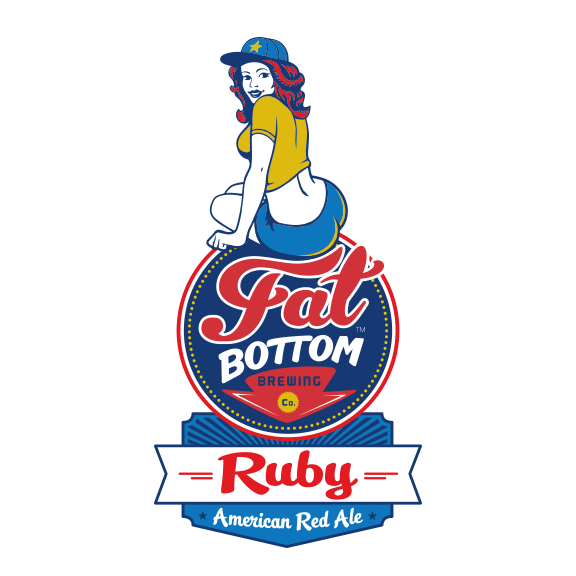


Fat Bottom Brewery:
Continuing our branding for Fat Bottom, this year we added two new logos and retooled the old ones. Once the girl on the old Ginger logo became the mascot for the brand, they asked us to create a new girl to represent Ginger. Knockout IPA is the newest addition to the lineup. (Heads-up: Knockout and Ruby will be the first two in a line of canned brews to be released later this summer!) We ended up updating the old logos to all have the same circular emblem to help keep the brand identity consistent across a variety of packages and uses. Check out their site!
Designers: Aaron Johnson, Andy Gregg, Joel Anderson


Whole Approach Business Coach:
Morgan Bultman coaches business owners on how to run a successful operation and stand out in their field. Part of improving a business means knowing who to turn to for a good logo. Originally the client wanted a logo that was more earthy and vintage looking, but in the end we found a happy medium that related more to a business while still having an element of earthiness.  
Designer: Edward Patton

KerriA Designs:
A talented jewelry artisan asked us to create a logo for her. She makes beautiful hand-made, earthy and organic-looking necklaces, earrings, etc. We used earth tones and rendered an artsy, creative, and stylish logo to match her products.
Designer: Ligia Teodosiu


Old Glory Distilling Company:
Fine spirits take time to mature and a master distiller has to be good at planning ahead. Matt Cunningham knows how to plan two steps ahead and the extra time we had to devote to his packaging and branding really paid off. Playing on the history of their location and the old glory nickname of the American Flag, this colonial-looking logo is designed to integrate well with their packaging. Follow their progress as they build their distillery!  
Designer: Aaron Johnson


Capitol Theatre:
Capitol Theatre is a classic movie theatre retrofitted to host events, weddings, theatre, and of course movies. Their building and interior have an art deco era look and we wanted to convey that classic movie theater vibe in the logo. Check out their space and events!
Designer: Aaron Johnson


Merch Mania:
This client asked us to create a logo for his promotional merchandise biz. He puts logos on cool stuff like shirts, hats, pens and those thingies that keep your beer cold. His products are intended to make a statement and get a brand mark noticed. We created a logo fusing 2 Ms together to make an exclamation point. Then we used some punchy eye-catching colors to make sure his logo gets noticed!
Designer: Edward Patton & Joel Anderson
That’s all for now. We have some other cool logos that are in the works, but until the products hit the market, we are sworn to secrecy! We look forward to showing off more branding whenever we can get around to it. Until then, keep it creative!