
Have you seen our new 2013 wall calendars? If you ever wondered how Anderson Design Group became so obsessed with poster art and calendars, read on...
For many years, we dabbled in creating quirky self-promotional gifts, brochures, mailers, etc. to show off our design and illustration skills. We also fiddled around with making gifts that we could send our clients as tokens of our appreciation for their business. After producing Millennium Bug Survival Kits in 1999 (which included necessities that people would need if the world descended into chaos,) we decided to make our next self-promo/gift something that folks would want to look at every day for the next 365 days. So we tried creating a wall calendar featuring our art.
One of our first attempts was a spoof on the corny but popular Successories posters—cheesy stock photos with smarmy motivational slogans. We called it SICKsessories and totally ripped on the whole office culture.

Then 9/11 happened, and we were really ticked at terrorists. So we made a Don’t Mess With The U.S. calendar full of patriotic imagery that taunted cowardly terrorists to show their faces to us rough-and-ready graphic designers.

Our next calendar was in the early days of PhotoShop, and we used that dangerous new technology to fuse animal heads onto humans in another office humor calendar.

One thing leads to another...
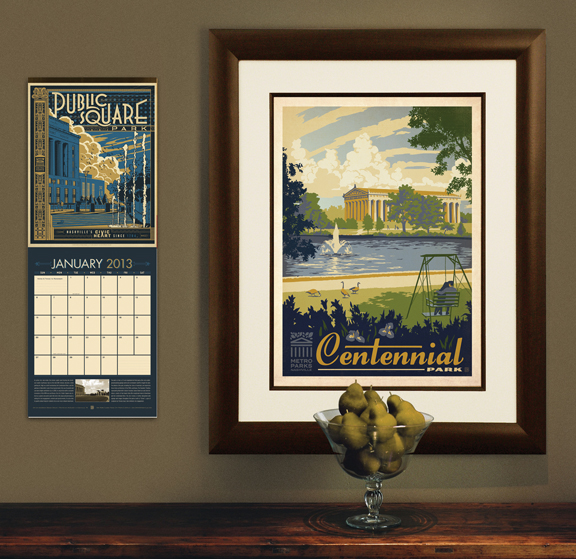
History was made when we stumbled onto an opportunity borne from necessity. (Isn’t that how the best inventions happen?) Our clients from New York or L.A. just didn’t understand how we could create excellent design and illustration, or be so in touch with popular culture while living in Nashville, Tennessee. We needed to prove to them that Nashville is about a lot more than Country Music—that we really do have all our teeth (or most of them), and that we talk about other things besides NASCAR and WWF Wrestling. So we chose our favorite landmarks, restaurants, arts & culture venues and Music City themes and we designed a series of 13 posters to showcase our great city.
Mohawk (a paper company) was looking for an innovative way to showcase their paper. We had a great relationship with McQuiddy Printing, who wanted to create a gift and showpiece for their clients. So a 3-way joint-promotion made it possible for us to combine the 18" x 24" posters into a giant wall calendar that blew everyone’s mind. Every calendar included 13 limited edition gallery prints. (Each calendar was valued at over $300! Those were the days before the economy tanked. Back then, everyone could afford to throw money around like that.)

Our 2004 Spirit Of Nashville wall calendar changed everything for us. We won so many awards for that piece, we lost count. Folks from all over the world were calling to find out if they could buy the prints from the 2004 Spirit of Nashville calendar. So we created a new print series that we would continue to expand for many years to come.
We did one more large format poster calendar for 2005, but as the economy sagged, everything had to get smaller. In 2006, we began creating 11" x 14" calendars that actually fit into people’s cubicles or kitchens, and we began using the smaller calendars to promote new lines of full-sized limited edition gallery prints. Almost over night, we grew another division of our company. We stepped up our efforts to create more poster art that would become our next calendar.


New for 2013...
We have 2 lines of prints to promote for 2013. One is a labor of love for our community—a Metro Parks calendar full of 13 prints that celebrate Nashville’s parks and public green spaces. In addition to the calendars, we have also created ready-to-frame prints, and a 22-piece postcard set so that folks can own all of our parks designs in a compact format.


This new World Travel calendar features 13 different 11" x 14" prints that can be framed. They are all adapted from the ever-growing series of World Travel gallery prints. And for anyone short on wall space, we have also made a 24-piece postcard that features mini versions of all our 2012 World Travel prints.


We are giving a limited number of our latest 2 calendars to our clients as gifts (while secretly promoting our skills and enticing them to send us more biz.) We have also reserved a limited supply of calendars to sell on our web site. They make great gifts... so get yours while supplies last!
Happy Holidays!


