Several months ago, a tasty project came our way—and we could not wait to sink our teeth into it! The client wanted to renovate a popular Nashville performance venue called 12th & Porter and open a pizza restaurant next to it. (Pure genius—when people line up outside the venue, they will smell the pizza while they are waiting to see a show—and of course, they are gonna want some!)

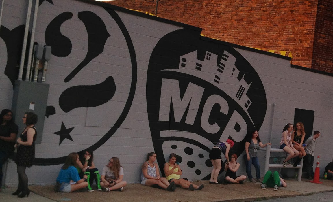
We started by creating a bunch of rough logo concepts. All our designers submitted options. (That is our favorite way to create a logo—get everyone in the firm to cook up a few ideas and see which ones the client likes best.) Some logo ideas reminded him of heavy metal. Others looked like Hip Hop. Since Music City is about lots of different styles of music, the client settled on a logo that had more cross-over power. He chose an option that was part guitar pick, part slice of pizza. (The winning logo was created by staff artist Ligia Teodosiu.) After messing around with lots of color options, we chose black & gold—the branding for the 12th & Porter music venue was already black, and gold reminded us of yummy, gooey cheese.
After Ligia nailed down the logo, the team created a bunch of cool art that could be used to decorate and promote the joint. We wanted the graphics to represent several different musical genres. We started out using a lot of color. But as we experimented, we realized that many of our colors were not really food colors (thus, they were not very appetizing.) They were also too varied to serve as solid brand identifiers. So we slimmed down the palette to make the art more simple and bold fit the new brand look we had established.


The resulting designs created an artistic language that felt energetic, grungy, underground, hip and urban. This pile of art served as a great starting point for the menu design.
 Creative Director Joel Anderson wanted to make the menus out of old double LP record jackets. The client liked that idea, but he wanted to create an album cover that was more about the new MCP brand. Staff artist Edward Patton stepped up and designed a killer LP record jacket. He made all the illustrations black and gold, and added lots of cool spray paint and urban graffiti touches to help the vibe look and feel like an underground music hot spot.
The client hired a record company to print off several hundred units of the LP jacket. Edward used brass fasteners to install clear plastic sleeves on the inside of the LP jacket. Since the menu was destined to change a lot, the client would be able to print out color copy menu sheets and insert them into the plastic sleeves. (The idea was to make the menu easy to update without having to re-print the whole thing!)


It’s
a good thing we created only 2 branding colors—most pizza box printers
charge a LOT more money to print multiple colors. So our saucy black
& gold branding scheme looked good and it saved the client a bunch of
dough!


