Monday, March 26, 2012

New Branding Project: Rahal Farms

Back in late fall, architect and farmer Michael Rahal approached us with a branding opportunity. He founded Rahal Farms, which is located in the historic farming village of Fernvale, Tennessee. His farm practices holistic, sustainable land stewardship, compassionate animal husbandry, and educational community outreach in order to produce healthful, delicious and ecologically sound food.

Photography by John Moessner

When we visited Rahal Farms, we were impressed at how Michael’s animals are given the opportunity to graze and roam freely and live together as a community. They all interact and behave like one happy family! The goal of our branding would be to suggest artful, healthy, earthy farm-fresh goodness while keeping the happy animals at the forefront.

Our challenge in designing the logo was to create something that could work across a variety of platforms, from product packaging, to signage, to a future event space and teaching kitchen. This meant that it had to be simple, and we either needed to use one iconic shape or custom typography to express holistic farming in the most traditional sense. Throughout our exploration, we wanted to be sure the logo felt warm, welcoming, and even nostalgic. Below are several of our initial ideas, created by Ligia Teodosiu, the lead designer/illustrator on this project.

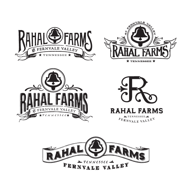

Based on the feedback we received from the client, we were able to narrow down the selection to a few favorites:


The clear winner became the logo that incorporated the "R" and "F" in a way that felt elegant, warm, and wholesome. From this we finished off the logo with earth-tone colors.


The simple design allowed us to translate the brand to the many outlets of Rahal Farms. Below is an example of the logo used as an extension of Rahal Farms, for The Kitchen at Rahal Farms:


Now that Michael had an evocative logo, he needed some packaging to boot. With his hens producing 400 eggs a day, we scrambled (no pun intended) to create an egg carton label so he could start selling his delicious farm-fresh eggs. He was looking for something that would really set his eggs apart on the store shelves and elevate his product above all others in the same category. It was back to the drawing board for us as we wrestled with the best possible way to sell his farm-fresh eggs. 


After several different attempts at establishing a look for the top of the label, we finally settled on one we all felt was egg-ceptional and carried the same look throughout the rest of the label. We finished it off with warm colors and an egg carton that not only complemented the colors of our label, but would really stand out on store shelves. 
 

The final label was printed on French Speckletone Paper in Cream Cordtone. We finished off the branding for Rahal Farms with some business cards, a letterhead and envelope, also printed in the same paper family. 

Once we had finished the branding and packaging design, we worked with our favorite web designers to translate the printed branding into an engaging on-line experience. We hired John Moessner to shoot beautiful photos and produce a moving film about the farm. Then we asked Kelly Bainbridge to write some informative text, and guide the process to create a web site that not only informs, but inspires people who love healthy, holistic farm-fresh products. (Ryan Pflasterer with www.BehindTheMule.com and William Donnall with www.SodiumHalogen.com did a fabulous job building the www.RahalFarm.com site!)


Tuesday, February 14, 2012

Our new line of prints: Vintage Ad Follies

The first step to recovery is to admit that you have a problem. OK—we admit that we are addicted to vintage advertising art and travel posters. So you’d think that after studying old advertising art for decades, creating over 80 classic poster designs for our Spirit of Nashville Collection, then doing more than 50 designs for our Art & Soul of America Collection, we might have gotten tired of the stuff.


As you’ll see, we have only dug in deeper, cranking out loads of new art that looks like it was found in a dusty corner of a defunct print shop. (We put the FUNK in defunct by salvaging and recycling pieces of our older designs and giving them new life with new color palettes and themes.)

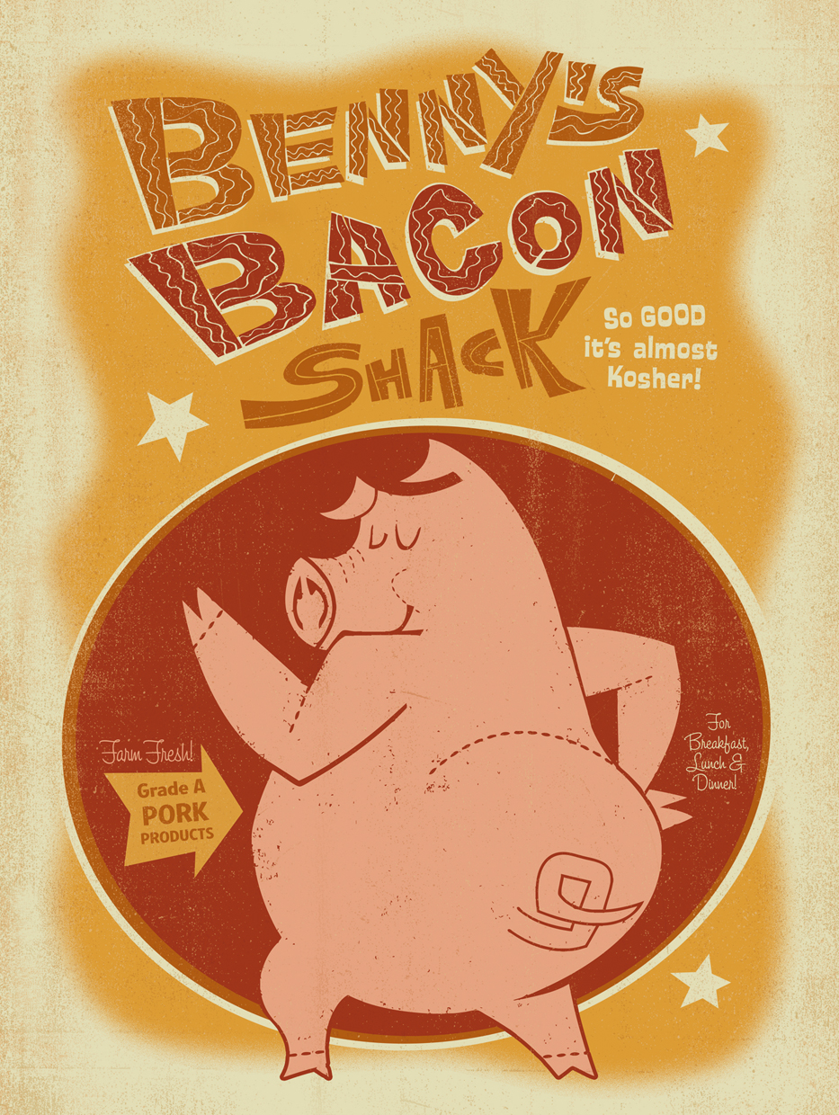
All of this has resulted in our latest series of classic prints called Vintage Ad Follies: it’s a collection of faux advertising prints for products that never actually existed—but probably would have if we were alive back in the 1940s and 50s. Some of the designs were created for special occasions—like the upcoming elections, or prints for baby showers and decorating nurseries. Others have no real reason for existing whatsoever, except for the fact that we always wanted to illustrate a poster promoting bacon, chocolate milk, or hula dancers.

 
America is going to be sick of the elections by the time they finally get here in November—so we have created some art to help everyone survive by poking fun at the whole spectacle. (We are equal-opportunity spoofsters, so we have created something for political pundits on both sides of the isle.) Here are the first 2 designs in a series that will grow with the headlines for the next several months!


The style gurus at Fab.com love our prints so much that they will feature our new poster collections 4 times this year (on Feb 23rd, May 17th, August 30th, and November 15th.) For each of these special sales, we will introduce new lines of prints, building on our love of hand-lettering, illustration, and adapting bits of old public domain art to create new prints with an old look and feel. This is a peek at some of the new designs we’ve just completed for the Fab.com sale.


Some of these are designs already available on our Anderson Design Group Studio Store site. Others will be for sale exclusively on Fab.com from February 23-25. Enjoy!

Wednesday, February 1, 2012


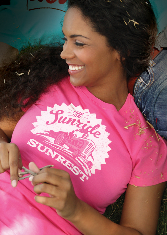
Our pals at Farm Boy Brands asked us to create a few more designs for their upcoming apparel collections. (They create cool stuff for folks who dig life on the farm.) We love working with them—our illustrative design is a natural fit with their vintage-Americana style.

The process works like this: their art director sends us a list of phrases and shirt colors. We sketch up rough ideas. Once they sign off on our sketches, we roll up our sleeves and fine-tune the designs to reproduce in 3 to 5 solid ink colors for screen printing or stitched designs on t-shirts, pillow cases, hats, etc. The hat shown above is a spin-off from a best-selling shirt Ligia designed last year.


Andy sketched up this concept for the Sunride Sunset shirt. With a simple color change, this design went from a rugged dude shirt to a sassy chick-tee!


Ligia got her hands dirty creating two design options for the Get Your Dirt On shirt. While both options were very cool, the simpler, cleaner design won out in the end.


Here are two more shirt designs we did for the 2012 catalog. All of these designs will be featured in the Farm Boy Brands Spring/Summer 2012 Collection and Fall/Winter 2012 Collection.


Check out all the fabulous Farm Boy/Farm Girl designs at their official web site!


Thursday, January 19, 2012

Tasty NEW 2012 Music City Wall Calendar!


Each year, we create a new series of vintage style illustrated prints. And each year, we partner with McQuiddy Printing (a local 100 year-old printer) to produce a limited edition promotional calendar featuring our new designs.

Nashville’s unique combination of excellent food, music and art has always inspired us. And so it was pretty easy to sink our teeth into this year’s calendar theme—we just went around Music City tasting everything from chocolate to BBQ sauce, wine, Soul Food, doughnuts, pancakes, tacos, roasted nuts to coffee, fried chicken and cupcakes. Then we worked off all the calories by creating loads of delicious-looking poster art!


This year’s wall calendar features 13 months of classic poster art celebrating a different Nashville restaurant or shop with an 11” x 14” illustrated print. We have also included some photos and a little historical info, along with 8 recipe cards featuring tasty Music City food & drink ideas.


To create the calendar, we looked around town for 13 different icons of taste—award-winning establishments that define our city—places that are truly unique to Nashville. We worked with the owners of each restaurant or shop to tell their story in a poster design and via photos and text that we added to the calendar pages. We even asked for (and got) 8 recipe ideas from these award-winning restaurant owners to include on a set of 8 recipe cards!


This calendar features several brand-new designs plus a few beloved classics from our collection. We designed it so you can cut out the 13 ready-to-frame mini prints and decorate your walls with them. Our mini prints normally sell for $19 each. So at $24.95, this calendar is a real deal! Hurry and order yours before they sell out. They are available at our studio Store or on our Spirit of Nashville web site.

Friday, December 16, 2011

Hume-Fogg 100th Anniversary Print


1912 must have been an exciting year! This 100th anniversary poster for Hume-Fogg High School will be the 3rd 100th anniversary poster we've done in recent months (the other centennials will be celebrated by The Girl Scouts and East Nashville's Shelby Park).

We had wanted to create a Hume-Fogg poster for a long time, and though we’d had a few requests over the years, we weren't sure if there was a large enough audience for it. Boy, were we wrong! Over the last few months the Hume-Fogg Alumni Association gathered support by pre-selling over 400 prints. With that sort of interest in the print, we were happy to oblige. Staff designer/illustrator Andy Gregg was put on the case, and below is his process from start to finish.

This was the initial concept thumbnail. The Victorian/Edwardian style was chosen as the base aesthetic of the poster because it was popular at the time of Hume-Fogg's founding, and fit somewhat with the Tudor Revival style of the school building.  Originally, just a sword was placed beneath the type as a nod to the the Blue Knight mascot.

This was the second thumbnail produced. Our contacts at Hume-Fogg wanted Hume-Fogg's old and new mascots added to the composition, so the poster would appeal to both old alumni—who identify as Blue Devils, and new—who are known as the Blue Knights. The dates 1912-2012 were added and the composition was fleshed-out more. A clean outer border was added to counteract the overwrought nature of the chosen Edwardian style.

Eventually the composition was ready for its final iteration. Andy enjoys the boring minutia of type design, and thus created all of the lettering from scratch. He also started drawing the Hume-Fogg building from reference photography he shot. Because of these two facts, this poster was possibly the design that took the most man hours to complete of any poster in the history of ADG. We fear Andy may have temporarily lost feeling in his clicking fingers and permanently lost part of his soul.


See the lack of luster in his eyes? That luster is now in the poster.


It was well worth it though, as the response we have gotten has been tremendous. Andy even signed a limited number of 50 for a select few alumni. For those who didn't pre-order a print through the Alumni Association: don't fret. We have about 150 extra prints for sale here at ADG in our studio store. Each print sells for $39. Stop by, pick up a print and say hi!

Wednesday, December 14, 2011

NEW Classic Chicago Posters

Our Art & Soul Of America Collection of prints and gifts continues to grow. Thanks to Fab.com, Pinterest, and other cool design-oriented sites, folks from all over the world have been checking out our work, buying our prints, and decorating homes and offices in classic Chicago style. Spurred on by the success of our early Chicago concepts, we have expanded our collection of Windy City prints to 9 designs. We will keep adding new art as inspiration and demand dictates!


The first few designs were by Andy Gregg and Luke Howard working under the direction of Joel Anderson, the creator of the Art & Soul of America Collection. More recent Chicago prints by Andy Gregg, Julian Baker and Shelby Roddefer have helped to expand the series and bring even more variety to the line. For example, Andy was inspired by the 1960s-era travel posters published by TWA. So he created a beautiful Buckingham Fountain design that leans more toward modern design than his popular Deco-era Chicago Theatre or Magnificent Mile prints. Below is a row of TWA posters that inspired his Buckingham Fountain creation (featured under the TWA designs):


Below are examples of the period range our Chicago designs have covered—from Julian Baker’s early 20th century Water Tower design to Shelby Roddifer’s contemporary 21st century Cloud Gate design.


So far, this Deco-style design by Luke Howard has been the best-selling print in the collection. Our 6-piece set of vinyl magnets has become a popular stocking stuffer item for the holidays!


Stay tuned to see how our other lines are coming along. New York and San Francisco are also becoming very popular print series, too. They can be seen at our ArtAndSoulOfAmerica.com site.