Tuesday, October 12, 2010

Design like a Fool!


Recently, a really cool company called Book Fool asked us to help them create 2 new t-shirt designs that would appeal to college students. (Book Fool sets up near college campuses and offers cash for used text books. Then they sell the books online at a discount, infuriating college bookstores, while helping students save lots of money!) Book Fool was looking for an underground way of promoting their brand on campus—something pretty hard to do, since companies are not allowed to advertise on school property. They also wanted to reward "Friends of the Fool" with some fun, irreverent swag. The solution: we decided to create some really cool shirts, so students could legally advertise all day long in shirts that they would be proud to wear.

Our hip young team of designers were in college recently enough, so they knew exactly what to do: 
1. Andy Gregg illustrated and designed a shirt based on old pulp fiction Sci-Fi movies and novels. (Even though the budget only allowed for about 10 hours of design time, Andy went the extra mile by pouring his soul into 65 hours of sketching, inking, and Photoshopping. He even pulled an all-nighter to finish it off, then slept in his car for an hour before popping back into the studio to work another day.)


2. Ligia Teodosiu designed a shirt in the persuasive style of Victorian newspaper advertising. (She didn’t have to work all night to finish her design, but she did spend many hours studying and illustrating turn-of-the-century facial hair fashion.)


The results were totally what you might expect. Book Fool is getting rave reviews, and from now on, students everywhere will probably use their “used book money” to buy cool t-shirts instead of beer. We feel pretty good about our contribution to collegiate fashion and sobriety!

Check out Book Fool’s blog site...

Friday, October 8, 2010

Gettin’ Saucy


When local BBQ legends Andy and Katie Garner asked us to help them create a brand for their famous BBQ sauces, we said YES without even having to think about it. That’s because we LOVE their smoked ribs, pulled pork, brisket, turkey & chicken. But the secret to Hog Heaven’s success has always been in their sauces. You can get them in a little plastic tub with your meal, but until now, the sauces have not been available in a bottle.

We started by batting around names for the brand and the individual sauce
s. They had a Barnyard Brawl theme stuck in their crazy sauced up heads. We loved the idea of food-fighting animals, and over the course of the design project, the brand became BBQ Fight Club with sauce names like Kickin’ Chicken and Punching Pig. ADG staff designer/illustrator Andy Gregg rolled up his sleeves and started inventing awesome fight club characters for the label art (which will eventually become trading cards and posters to help promote the sauces!) The process was a blast, and the end-product definitely lives up to its name.

The process started (visually-speaking) in a low-rent Luchadore district, wandered around in a stylish zip code, and ended up in a hot & steamy barnyard brawl fight club. Note the progression of the sketches and colors:


Hog Heaven sauces can be bought at Hog Heaven or at the Spirit of Nashville store.


Tuesday, September 28, 2010

Steeling the Show


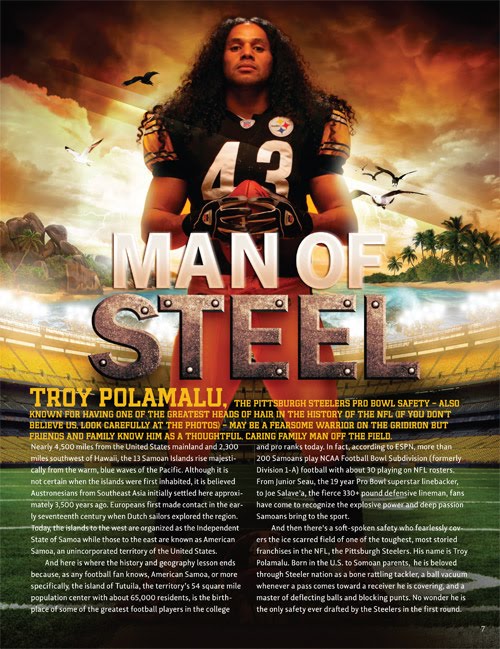
We have worked on a magazine called On Track for many years. This annual magazine was created by Venture Publications, and is purchased by Community Colleges who want to encourage middle school and high school kids to stay in school and go on to college after they graduate. Each issue needs to
feature a celebrity that will get the kids’ attention and make them pick up the magazine. And every issue needs one show stopping centerfold that will end up on a kid’s wall, serving as inspiration to follow their dreams. This year, pro-bowl NFL player Troy Polamalu of the Pittsburgh Steelers agreed to share his inspiring story with On Track Magazine.


Edward Patton, our resident sports authority and Terrible Towel-waving design star was the right man for this job. He started with the text and some mediocre stock photos of Troy in action. The photos were pretty cluttered, and there was not much to arrest the eye.

It was going to take a lot of magic to make the article and the poster come to life... (but that’s never been a problem for Edward before!) After working some Photoshop genius into a solid layout, Edward created a truly stunning piece of editorial design work. Full of energy and crazy cool detail, this poster and 2-page spread “stole the show” as the coolest chunk of the magazine. The client was very pleased, and we are sure that thousands of kids will pick up the magazine and be drawn to this uplifting article. Hopefully, they will be inspired to stay in school—and maybe even become graphic designers!


Thursday, September 16, 2010

Art for ReTune Nashville

Four months after the historic flood, many Nashville businesses and individuals are still struggling to rebuild their lives. Among the hardest hit were the local musicians who stored their gear and instruments in a facility called the Sound Check. The entire place flooded and millions of dollars worth of musical instruments were ruined overnight. Sheri ONeal, A local photographer began collecting damaged instruments and giving them to local artists who would turn the sad remains into brand new pieces of art for an upcoming charity auction. Thanks to her efforts, and then the enthusiastic involvement of many others, ReTune Nashville was born. The big event will be on October 23 at 7:00 pm at the SoundCheck. Funds raised will go to: Nashville Musicians Association Flood Relief Fund and MusiCares Nashville Flood Relief.


Two months ago, Anne Browne of the Arts Company handed Joel Anderson a beautiful (but useless) warped guitar that had been salvaged from the SoundCheck. He immediately started to think about how to turn it into a piece of art for the auction.


Eventually, he created a giant collage built on a salvaged door layering together his flood relief posters along with a bunch of picks, strings, bottle caps and drum sticks donated by other musicians he knew. Joel cut a hole in the door and lowered the guitar into the cavity and sealed everything up with an acrylic medium. Kevin Dransfield from
Belle Meade Framers donated the frame to finish it off. The finished piece is called Play On. All together, it was a cool melding of graphic design and fine art. We hope the piece raises a bunch of money for this worthy cause!


Friday, July 30, 2010

Will Work For Food

Design can change the world... especially when your world is awesome BBQ and smoked ribs! Our design firm just happens to be down the street from one of Nashville’s favorite BBQ joints—Hog Heaven. When the wind is blowing just right, the heavenly aroma lures us down the sidewalk to the little rib shack run by our pals Katy and Andy Garner. They sure do know BBQ, ribs and sauces... but they admittedly don’t know how to create a brand for their amazing food. Since we love eating BBQ and we happen to know a thing or two about branding, we figured this would be a match made in heaven!

Owner Katy Garner poses under her new sign with 2 mocked-up bottles of sauce. (The sauce will hit the market soon.)

This hand-painted alley wall was the only branding Hog Heaven had. (Notice the original hand-lettering on the hog’s butt!)

Katy & Andy called to tell us that Food Network was coming to film a special about their famous white sauce. We had talked for a long time about creating a logo, branding, store signs, and designing some packaging that would help them take their sauce to market. Now we had a real deadline of 3 weeks to make it all happen before they found themselves on national TV without any branding. (They have been in business since 1986 and all this time, they never even had a sign ou
t front to let folks know where they were located! People just followed their noses to get there!)


We started with sketched logos, then created color options, and finally chose a winner. Then we applied the logo, colors, & fonts to a menu, t-shirts, and new art for a bricko block wall that one of their employees had painted several years ago. We also mocked up some bottles for their sauces which are due to hit the market this Fall. (We will unveil the sauce labels in the near future!)

Our goal was to give Hog Heaven some cool new branding that looked like it had always been there. Part of Hog Heaven’s charm is that it is a little old BBQ shack next to a crappy biker bar, near to Centennial Park. Everything we designed needed to suggest hand-pulled pork at a casual, friendly “mom & pop” dive.
These sketches were just a little too cute. So we tried some other options to make the brand a bit more serious.


After a few rounds of sketches, we dreamed up some fun color options. Once we narrowed down the concepts to a final design, we had about 2 days to whip out art for signs, menus, t-shirts, sauce labels, and the alley wall (which Katy and Andy stayed up until 3 am painting the night before Food Network arrived for filming!

Katy & Andy spent 48 hours painting, installing signs, etc. on the hottest days of the year.
All this was done on a shoe-string budget, for the love of design and hot BBQ. To keep the design fees low, we agreed to trade-out a bunch of design time for free food. It was a lot of work under hellish conditions, but the results are quite heavenly!

Saturday, June 26, 2010

Logos


Logo design is one of the hardest things we do as designers. Don’t get me wrong—it’s fun to work on the same little puzzle for days on end and then do 30 rounds of revisions until you have met the marketing objectives, figured out the client’s personal tastes, and created something you are proud of.

It doesn’t always work, but when it does, it can make all the difference in the world to your client. For better or for worse, logos stick around for a long time. (One of my worst logo memories haunts me every time I see it—plastered all over the back roads of United States—more than 10 years after we created it! The Hunts brothers Pizza guy can be seen at every rural gas station and convenience store in the country. You may know it as the pizza guy who looks like Saddam Hussein.) I love hearing the conspiracy theories about this infamous logo... some people actually think this is a business that was founded by the Bath Party as a money-laundering scheme to buy weapons and support terrorism! In reality, the client just kept tinkering with the art until we gave up and said “have it your way!”

The logo is everywhere. If I made a penny for every time it is used, I’d be hanging out with Bill Gates.


Logo creation is about 50 things at once: it’s creating a visual icon—a reminder of what the brand is, why it is special. it’s about making sure the logo gets noticed, reads clearly at a glance, is memorable, and communicates effectively. You must make sure it is easy to reproduce in all sizes and media. For the next few months, we will post a few examples of logos & brand identities that are particularly interesting.


Friday, June 4, 2010

Olive & Sinclair Chocolate packaging featured on The Dieline

The Dieline, known as the #1 packaging design web site, featured our work for Olive & Sinclair Chocolate Company. We are truly honored to be recognized by such a prestigious collective. Some of the blog's comments include:

"It's the antithesis of Method, Pepsi, et al. A brand with character always outshines a brand without;"
and "These are so beautiful I'd frame them."

Thanks to the folks at The Dieline!